© Copyright Mindus SARL, 2024 All rights reserved.
This is the multi-page printable view of this section. Click here to print.
Documentation
- 1: Introduction
- 2: Getting Started
- 2.1: Connect devices
- 3: VirtualSpace
- 3.1: Actions
- 3.2: Connections
- 3.3: Editor and tools
- 3.4: Field Actors
- 3.5: How VS works?
- 3.6: Table editor
- 4: Starting UI design and UI creation
- 4.1: Start with UI
- 4.2: Layout managers
- 4.3: Create components quickly
- 4.4: Data-oriented components
- 4.5: The Property editor; base, layout and styles
- 4.6: Improvising HTML and CSS
- 4.7: Choosing a device list, device orientation and zoom
- 4.8: A note on Responsive design
- 4.9: Locking orientation for Mobile
- 4.10: Connect to a VirtualSpace
- 5: Starting data first
- 5.1: What does starting data-first mean?
- 5.2: How to use a Database?
- 5.3: Database editor
- 5.4: Database transaction types
- 5.5: Connect to a VirtualSpace
- 5.6: VirtualSpace Table creation
- 5.7: Web Services
- 6: Starting Java business logic and IIZI Development
- 6.1: Java class and method connections
- 6.2: VirtualSpace Actions and Java methods
- 6.3: Attaching methods to VirtualSpace entities
- 6.4: Attaching methods to VirtualSpace events
- 6.5: Back reference problems
- 6.6: UI Annotations
- 6.7: Location of code
- 6.8: Available APIs in iiziGo
- 7: Selectors
- 7.1: Anatomy of a Selector expression
- 7.2: The Selector Editor
- 7.3: Using Selectors
- 7.4: Device match
- 7.5: Language code
- 7.6: Wildcard and Regular Expression
- 7.7: Customization of selectors in Java
- 7.8: How to add selectors?
- 8: Editors, tabs and tools
- 8.1: IIZI IDE
- 8.2: The Panel Editor
- 8.3: The Property Editor
- 8.4: Keyboard shortcuts
- 9: Text content and Language
- 9.1: Externalizing Text
- 9.2: The Text Editor and the KString Type
- 9.3: Text components
- 9.4: Connecting text to components
- 9.5: Working with Text tables
- 9.6: Multi-Language Text table example
- 9.7: How to add text table on panel?
- 10: Images and Images Definition
- 10.1: Importing Images
- 10.2: Image Definitions
- 10.3: Image Definitions Videos
- 10.4: Dynamically loading Images at Runtime
- 10.5: Assets
- 10.6: Properties
- 10.7: How to add images?
- 11: Panels and Components
- 11.1: Layout
- 11.2: Panels
- 11.3: Properties
- 11.4: Components
- 11.5: Components List
- 11.6: Containers
- 11.7: Styles
- 12: iiziRun Development and App Distribution
- 12.1: Set up iiziServer for live development
- 12.2: iiziRun Developper
- 12.3: iiziRun Custom
- 12.4: Distribution of your iiziApp
- 12.5: How to run your application?
- 13: Examples
- 13.1: Code examples
1 - Introduction
Overview of the IIZI Platform
IIZI is the remaking of app: it is a unified platform to simplify application creation by targeting all devices and exploiting native mobile capabilities. The new technology provided by IIZI mixes solid and sustainable Java code with mobile technologies to design and build web-oriented enterprise applications. The IIZI Platform is the smart and quick way to make cross-platform applications, for small businesses to enterprises – it offers the best of traditional enterprise IT and emerging rapid IT. IIZI is the “aPaas” – application Platform as a Service targeting any kind of businesses.
It offers the following key features:
- Simplicity: one code for everything and all media/OS
- Security: integrated data protection, everything is stored on servers, not on devices
- Sustainability: adaptive applications for all current and future OS
- Analytics: integrated Big Data analysis tool
- Integration: apps ready to integrate existing systems to create great value
IIZI integrates innovative features such as:
- Green Streaming: any OS supporting the configuration can be used to run the server, serve multiple domains and provide streaming of multiple iiziApps
- Communication: live share apps, “Share” and “Follow me”
- Independence: free to choose its support
- Spirit: simple and different, almost everybody can code
The IIZI Platform consists of iiziGo, an Eclipse-based IDE, a development version of the iiziServer, an iiziServer in the cloud or in-house, and one or more module projects called iiziApps. Your iiziApp can have multiple specialized UI designs making it possible to target different devices of varying capabilities, formats and languages. Your iiziApp is a data consumer application and is not intended to provide data to other systems, only to be used to stream itself to the end-user devices.

IIZI Platform Structure
iiziGo – Development environment
The state-of-the-art development tool for building iiziApps is named iiziGo, a fully-fledged Eclipse IDE (2022-09 version 4.25 or better) environment using Java SE 64-bit version 17 and later. iiziGo runs on 64-bit operating systems only: Microsoft Windows 7 (with IE 11) or better; a release for Linux GTK and macOS is scheduled for later. The development tool allows workflow from the IIZI Explorer, Panel Editor tree, and Design Editor, including all familiar Eclipse integrated tools.

iiziGo Workspace
To access the IIZI Design Viewer, click on the panel component (in this case MainDesktop) for a desktop viewer or download the iiziRun Developer app for a phone and tablet viewer on a real device (Android and iOS). Go to Google Play or App Store and search for iiziRun.
As a plugin, iiziGo is nested in the Java Core of Eclipse and is integrated in the editing, compiling, refactoring and searching of Java code. Changes in Java code are reflected immediately in iiziGo and Java code is automatically refactored for all IIZI references.
Developping to the IIZI VirtualSpace
Multi-device and cross-platform development are achieved in the iiziGo by developing to the IIZI VirtualSpace: a unique concept to app development with the IIZI Platform. This distinctive programming model offers multi directional data-binding by developing to the VirtualSpace and its components, rather than coupling code directly to the UI. The resulting system is focus driven; changes on the end-user device will change focus in the VirtualSpace which, in term, controls the application flow.
Real-time on devices during development
The IIZI Platform enables simultaneous development for all devices and platforms. The native capabilities of today’s tablets and smartphones are made available to your iiziApp web-based product through the free and customizable iiziRun mobile app downloaded to your end-user’s device.
Connect any target device to your iiziGo installation and observe how the iiziApp looks and behaves in real-time, both in the drag and drop UI design stage and when you write the application business logic in Java. You can even choose to see the application in one of the target languages as you design it in your original language.
Your iiziApp, which runs on the iiziServer, programmatically accesses the end-user’s mobile device functionality using IIZI’s Client Gyro engine. In this way, device functions are extended to the server and application control.
Data providers and iiziServer
Data providers are plug-ins to iiziGo. Database and Web Services plug-ins are provided out-of-the-box, but new custom data providers can be created and added to the system as well.
The iiziServer runs stand-alone in a 64-bit Java SE 17 JDK (Java Development Kit) or better. There are two versions of the server; the Development iiziServer that runs not yet finished and/or completed iiziApp’s, and the Standard iiziServer used in production.
You can run your iiziServer in-house or in the cloud. The iiziServer is platform-independent, running on Linux, Windows, macOS, Mainframe, etc. – the choice is yours.
1.1 - iiziApps
How iiziApps run on IIZI Platform
The IIZI Platform allows immediate results on both desktop and the devices connected as you design and code your iiziApp. The optimal set-up in iiziGo gives you an immediate result in a web browser on both desktop and the devices connected to your development environment. In this way, the entire life cycle of your app can be previewed in the development stage.
The UI properties of your web application are mirrored using streaming between the server side and the client over a WebSocket. This connection is maintained during development, testing and exists between your server and client devices when your iiziApp is in the hands of your customers.
On the client side, your app is a web application with access to native capabilities for smart phones and tablet by means of the Cordova plug-in (formally PhoneGap).
Server and client on the IIZI Platform
iiziApps operate browser-based web applications running on the server-side in association with the iiziRun app for mobile, downloaded by the end-user. All your application coding is done in Java on the server side. On smartphone and tablet devices, your iiziApp controls a hybrid application which is partly native – using the device functions directly – and partly a web application using HTML5 and JavaScript. This is achieved by iiziRun mobile app, the runtime app built on Apache Cordova, formally known as PhoneGap, tailored for use on the IIZI Platform. Your version of iiziRun is customized to reflect the branding of your iiziApp business application.
iiziApps are streamed from the iiziServer to the client. The server side application requires an iiziServer that enables open communication through a web socket connection. There is constant and immediate communication between your server-side iiziApp and the end-user. It provides very fast communication protocol with zero or extremely low latency, meaning that the end-user gets data to and from the server instantaneously. If you are targeting desktop, no client-side app is necessary; on desktop systems, a pure web application interface is used through the installed browser.

iiziApp's and clients
Focus driven iiziApps
The UI flow is governed by the focus in the IIZI VirtualSpace and a Deployment of iiziApps to the end-user. This is done using the two focus engines built into App Gyro and Client Gyro. The focus model makes it possible to enable devices that are related to the user in question. The application could also continue to run off-line on the end-user device depending on how the iiziApp is designed. The off-line support is not yet available, but is planned.
When an end-user starts an iiziApp, a new client session is created in the server’s Client Gyro engine. The Client Gyro is then either starting a new App Gyro application session, or connected to an existing App Gyro application session of the same user. This enables an end-user to start an iiziApp from a phone or other device and then, even in parallel, pick up the same application session from a different phone, a tablet or a desktop system, or to start a new application session. The server and/or application is configured for parallel session support by default, but is optional and can be reconfigured either in the server or the iiziApp in question.
Deployment of iiziApps
Your iiziApp can consist of iiziModule projects and Java projects. It can also refer to libraries and directories containing Java code, both project-based and external. To run the application on an iiziServer, the iiziApp must be compiled into a Jar file. This compiled Jar file – the Application Distribution – is produced in the Application Distributor utility integrated into the iiziGo. The Application Distributor is also available as a stand-alone Java program that you can run from a batch file or build system such as Maven, Ant or Gradle.
Other technologies employed
The UI of your iiziApp uses Dojo Toolkit JavaScript framework for desktop and mobile. Although JavaScript is used on the end-user to run the iiziApp, the JavaScript and Dojo source code are hidden from the development process; all development is maintained in Java on the server side. The JavaScript source code of your components is not available to you. However, the skinning, sizing, positioning – and much more – are exposed as component properties in the Property Editor. When running in Eclipse, the IIZI integration with Eclipse Data Tools Platform (DTP) is used, while the server uses a direct JDBC implementation.
An automatic translation engine using Microsoft Azure Cognitive Translation and/or Google Translate services is provided to speed up simultaneous development of the localized application for preparing a world-ready application. Select the source language for development and you get automatic foreign language translation in the background. You can view your UI design and data representation on any device, in any language, at any time. Your application’s text content, once translated automatically, can be flagged for verification by a translator or language specialist.
The IIZI Platform Java API
The many methods exposed by the IIZI Platform Java API are available to you through Eclipse’s Java code completion. The IIZI Core and Plugin Libraries are not visible in the IIZI Explorer, but only in the Eclipse Java Editor and Package Explorer. For the complete IIZI JavaDoc API, see the IIZI Support site.
1.2 - Setup
Setup Requirements and Updates
iiziGo is based on Eclipse and comes in 3 installation types for Windows:
- Win64 iiziGo setup executable including Java SE 19 JDK.
- Win64 iiziGo setup executable without Java.
- Jar file containing an image of iiziGo. Once unpacked, start iiziGo by launching the iiziGo.exe executable. For the two latter installations, you must have a 64-bit Java Development Kit (JDK) Java SE 17 or better.
For macOS, a Disk Image (.dmg file) installs iiziGo without Java JDK. You must install e.g. Eclipse Temurin OpenJDK, Oracle JDK 17 or other OpenJDK 17 with Hotspot JIT compiler or better.
Minimum Setup Requirements
The iiziGo is released for Windows and macOS. The following minimum specifications are required to work with iiziGo:
- You must have access to admin privileges on your system.
- A large screen (typically 27" or better) with a high resolution, minimum size in “Full HD” (1920×1080) but higher is strongly recommended (typically 2560×1600 or better).
- 8 GB of RAM or greater (16 GB recommended).
- Windows 7 64-bit version or better or macOS High Sierra or better.
- Chrome (Canary) or other browser for developers.
- 64-bit Java Development Kit (JDK) SE 17 or better. This does not apply if you choose to install the Win64 iiziGo setup that includes Java.
The iiziGo Eclipse Java process is by default configured to 2 GB Heap Size in iiziGo.ini located in the installation directory.

iiziGo installation directory files
Versions and updates
Easily update iiziGo as you would any Eclipse plugin; go to Help > Check for Updates, or click on the update prompt when update notifications appear in your iiziGo IDE.

iiziGo - Check for Updates
Download installations
Download the setup installation files from the IIZI Support site.
For Java JDK’s, see the Eclipse Temurin OpenJDK at https://adoptium.net.
Installing iiziGo under Windows
The Windows installation generally requires Administrator’s privileges on the machine. Open the IIZI Support site at the Downloads — Latest version page.

IIZI Support site - Downloads page of latest version
- Select
iiziGo Designer installer with OpenJDK 18 with Hotspot JIT compilerto download the Full IIZI Platform including Java Development Kit (the version is at the time of writing being changed to Java 19). The download is fairly large, about 550 MB. - Launch the installer.
If you have a Java JDK 17 or better, you can download and install the iiziGoSetup-M.N.P.12345.exe executable Windows Installer, otherwise choose iiziGoSetupJDK-M.N.P.12345.exe (numbered with a version number followed by a build revision number).
Please note that a Java JRE is not sufficient as some tools in the Java JDK are used by iiziGo.

Windows SmartScreen show a dialog box
In case Windows SmartScreen shows a message box, press Run to launch the Setup.

IIZI Setup dialog box
Once you press Next > in the Setup dialog box, you will be prompted to specify the installation directory of iiziGo. It is recommended to use the default C:\iiziGo-JDK for the Setup that includes Java JDK or C:\iiziGo for the Setup without Java JDK.

IIZI Setup directory selection
At the end of the installation, you can launch iiziGo. When iiziGo first starts, the Windows Defender Firewall generally shows the following dialog box:

Windows Defender Firewall dialog box
Select the appropriate check box(es), in this case Private networks but Domain networks are common in workplace networks or Public networks if your computer is not in either such network type. If you omit to configure the firewall, you will not have access to iiziGo from a browser, even on your own computer. The access is granted to the Java runtime executable javaw.exe. When you later launch an iiziServer, e.g. inside iiziGo, you will probably get a similar dialog box, this time with the Java runtime executable java.exe.
Once iiziGo has started, you will be prompted to Sign in for new users or to Sign up for returning users.
Important information about Anti-Virus
During installation and launch of iiziGo, some anti-virus software blocks Java Development Kit executables that are vital to running iiziGo. The files are typically javaw.exe and java.exe, but can also be iiziGo.exe. If you encounter an anti-virus warning or error to e.g. quarantine or remove those files, please reply No or Add an exception for them depending on your anti/virus software. These files are the original files from 64-bit version of Eclipse Temurin OpenJDK Development Kit.
Continue reading with Getting started.
2 - Getting Started
Getting started with IIZI
THIS PANEL NEED TO BE CORRRECTED
Get started with IIZI development by first downloading and installing iiziGo.
Create your IIZI Profile
For first-time users, a Getting Started with IIZI wizard will automatically appear.

The first page in the wizard describes what is done with an option to create your first template iiziApp
The wizard contains several pages and will perform the following:
- your iiziDeveloper account used for IIZI Support,
- information for a free Code Signing Certificate required when you distribute iiziApp’s, and
- an optional self-signed SSL certificate.
The important part of the wizard is the creation of the iiziDeveloper account with the Code Signing Certificate used when you distribute signed iiziApps.

The wizard page where you fill in data for the iiziDeveloper account
Create your iiziApp
The iiziGo environment makes it possible to develop iiziApps from either the UI side-first, or the data provider-first, or Java code-first, or any combination of these techniques. Your iiziGo allows both mobile-first or desktop browser oriented development. UI designers and UX professionals can also use the iiziGo to create the user interface without programming expert skills.
Creating your first iiziApp
How to create iiziProfile wizard helps you to create the base for your first iiziApp. There is a tutorial video just down below.

First wizard page where Project name and options and selected
Fill in the Project name, select which UI's should be created:
- Phone
- Tablet
- Desktop
and whether the app should use text tables to store texts localized for the app’s target languages. Next, if the option to Create text tables with automatic translation is selected the next page in the wizard is shown:

Second wizard page where you specify the app's target languages
- Enter your
Project name. - Tick the device types you want:
Phone,Tablet,Desktop. - If you wish to target multiple languages, leave the tick to
Create text tables with automatic translation. - Choose the target languages by
typing in the language codeor byfiltering the languagesand clickAdd. The first language specified is the base language, i.e. the language you intend to use when you develop the application. When you useautomatic translation,English (en)is recommended as Google Translate or Microsoft Azure Cognitive Service to translation gives the best result as it translates accurately. See Automatic text table translation for more information. - Click
Finishand you’re ready to go!
Creating a new iiziApp
- Right click in
Project Managerand chooseNew > Project. - Under
IIZI, choose to create a newIIZI Module Project (Quickstart).
")
New Project wizard > IIZI > IIZI Module Project (Quickstart)
Alternatively,
- Choose in the main Eclipse Menu Bar
File > Newor typeAlt + f. - Select
New IIZI Module Project (Quickstart).
After the New IIZI Module Project wizard is open, repeat the instructions as explained in the section above Creating your first iiziApp.
IIZI Module project and Project properties

The IIZI Explorer view
Your new project is referred to as an iiziApp or/and IIZI Module Project.
Your new iiziApp will appear in the IIZI Explorer with the project’s folder structure already created for you.
Inside the VirtualSpaces folder you will find a default VirtualSpace named mainVirtualSpace.
The Panels package contains folders and a mainPanel for each device: one for phone, tablet and desktop.
The IIZI Explorer is used instead of the Eclipse Package Explorer because it is tailored for the IIZI Platform. If you choose to enable additional connector plug-ins, there will be additional folders displayed in the IIZI Explorer for the respective connector.
Application properties
By creating your new iiziApp through Quickstart, your project will have default initial-focus (or Startup > Focus) which indicates the Panel that will open first when your application launches.
- Right-click
your projectand chooseProperties > IIZI > Appto find iiziApp Application Properties.

Context menu of the project
- Further global application settings can be found at
Windows > Preferences > IIZI.

IIZI Properties for the App – IIZI Module App
Automatic text table translation
If text tables are used, the first language will be the base language. The other text files will have their texts automatically translated from this base language text table. Google Translate or Azure Cognitive Service for text translation is used. Please note that there are limitations as to how much can be translated as the services in general are paid services. IIZI comes with a demo account with about 1000 free translations. You may reconfigure one or both of them with your own keys for the service in question.
Text tables opened in parallel using automatic translation
2.1 - Connect devices
Connect devices for Live preview
Here you will see how to connect on iiziApp from your phone?
How to connect on iiziApp on phone?
There is a tutorial video just down below.
To download iiziApp on phone you have to go on
GooglePlayorAppStore- Type
iiziRun Developeron search bar Downloadandinstallthe application.
- Type
Launch
iizi Run Developper- Choose
Add Application - Select
Server - Then click on
Add Server... - On Address:
type your server address.
Example:192.168.1.50
Secure: turn itOFF
Port:8080 Save, by clicking onthe iconon top right
- Choose
Click on
Application- Select
your application Save, by clicking onthe iconon top right
- Select
Click on
your application- Then select
Launch! - Your iiziApp is ready to use!
Repeat the above processfor any phone or tablet you wish to use for development and testing.- Make sure to select
newestorthe ID numbersof thesessionyou want to join.
- Then select
You are now connected to your application.
How to connect on iiziApp with webapp on your phone?
There is a tutorial video just down below.
Open your
Web browser- Go to your
local or networkiiziAppip addressand using8080as port
Example:192.168.1.50:8080
URL: http://192.168.1.50:8080/ - Tap on the weblink
here for the IIZI Development Server.
- Go to your
In iiziApp column tap on
start- Your iiziApp is ready to use!
Repeat the above processfor any phone or tablet you wish to use for development and testing.- Make sure to select
newestorthe ID numbersof thesessionyou want to join.
3 - VirtualSpace
What is the IIZI VirtualSpace?
You can create a main VirtualSpace for your application or use the VirtualSpace provided from the IIZI Quickstart project. The main VirtualSpace will allow you to create flexible code by directly referencing VirtualSpace Tables, Fields, Groups and Actions. These virtual entities carry all the data required, consequently, they will trigger and respond to client interaction, device states and events. The VirtualSpace of your project allows multi-directional data binding throughout your application.

VirtualSpace and its four component types
3.1 - Actions
VirtualSpace actions
Action editor for vsAction
The Action Editor panel is used to define actions and how the Action Actors – these are nodes in the IIZI transaction framework (TXP) – are to be ordered and which ones to use or connect to. This definition makes up the TXP process. See section Java class and method connections.

VirtualSpace and its four component types
For simple actions requiring just Java code, you can use the OnVSAction method when you have specified a Java class that is attached to the namespace, e.g. the namespace is called start and the vsAction my-Action is connected to the method onAction as:
    package mypkg;

    import com.iizix.api.vs.OnVSAction;
    import com.iizix.api.vs.VSActionEvent;
    import com.iizix.api.vs.VirtualSpace;

    @VirtualSpace(ref = "FirstProject:/vs/start")
    public class StartNameSpaceListener {

        @OnVSAction(name = "my-Action")
        public void onAction(VSActionEvent event) {
            // Code here...
        }
    }
Use the more … button to drop-down a menu to help you create the method. When you rename the VS Action, it will update you Java source code (name= “newName”), and if you refactor the method name using Java Refactoring, the OnVSAction definition will be set to the new name.
The Execution can also be specified to set a Timeout for the TXP process, and in the Thread choice defines in what thread it should execute in. The UI may be locked immediately when the action begins with Lock UI and when it ends using Unlock UI. If the UI is locked, it must be unlocked somehow; otherwise the client will keep on displaying an “hourglass”. This does not have to be when the action ends: it is up to you when and how to do it (the AppSessionGyro contains methods for the UI lock state).
Action Actors
The Action Actors are defined for a VS Action to make up the TXP process. Each actor is a TXP node, and the ordering is important. The process either completes successfully or rolls back. A failure to complete the process is logged in the server application log as well as to present the error in the UI.
The action actors that can be added are the ones you have created in the various data connectors, a special Java actor and the predefined actors:
| Predefined actor | Description |
|---|---|
| SetFocus | Set focus |
| SetSourceFieldValue | Set source field value |
| SetTargetFieldValue | Set target field value |
| TransportField | Transports a field |
| TransportGroup | Transports a group of components |
| TransportSelectedTableRows | Transport selected table rows |
| TransportSingleSelectedTableRow | Transport single-selected table row |
| TransportSingleSelectedTableRow-AndColumnToField | Transport single-selected table row and colum to field |
| TransportSingleSelectedTableRowToFields | Transport single-selected table row to fields |
| TransportTableColumn | Transport table column |
| TransportTableRows | Transport table rows |
| Each actor can provide (and generally do provide) editable properties that needs to be filled in. |
The VS Action has a property Target namespace that is used for the transport operations and the SetTargetFieldValue operation.
Java Action Actor
This actor is used when the Java code needs to execute in the TXP process as a node, i.e. it can handle commit and rollback, etc. The actor is a class that must extend
com.iizix.actionactor.AbstractJavaActionActor
/**
 * The Java Action Actor that takes a String parameter
 * and a LocalTime Value for show.
 */
@JavaActionActor(descr = "A simple Java Actor without rollback",
                 modifiesVS = false,
                 ref = "FirstProject:/vs/start/my-Action")

@JavaActorParam(name = "myString", prompt = "myString for show",
                type = JavaActorParam.Type.String)

@JavaActorParam(name = "myTime", prompt = "myTime for show",
                type = JavaActorParam.Type.Value_LocalTime,
                defaultInput = "00:00")

public class MyActor extends AbstractJavaActionActor {
    /**
     * Called when the TXP executes this Action Actor node.
     */
    @Override
    public void onAction(VSActionTXProcess process) {
        // Place your code here...
    }
}
The class above is an action actor that is connected to the my-Action VS Action, and prompts the developer to fill in two parameters myParam as a String and myTime as a ValueProp of the type LocalTime with a default value of 00:00. The dialog box presented to the developer looks like:

The feature of making it possible to store parameters for an individual Java Action Actor is very useful as it allows a class to be re-used in various places where the parameters can be used to set the context for the class instance. See the JavaDoc of the @JavaActorParam for additional annotation parameters such as allowNull, tooltip, etc.
The Refresh button in the dialog may be used if the parameters do not match the class if you change the class name. Pressing Refresh will reload the class annotations and refresh the properties displayed.
3.2 - Connections
VirtualSpace connections

Connect a panel to VirtualSpace from the property editor.
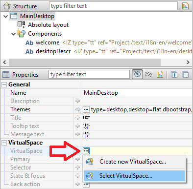
Whether you have started working on your new iiziApp through the UI, data-source or Java code, you have already made some connections to a VirtualSpace. It is recommended that you create the four possible VirtualSpace entities inside of vsGroups; these entities can then be updated and controlled individually or simultaneously by updating the vsGroup. This means that the VirtualSpace is likely to be a representation of the data model at a specific application instance.
To connect the UI components to VirtualSpace entities, the Panel must first be connected to a VirtualSpace. In this way, you will connect UI components that handle data to a VirtualSpace entity. UI components which handle actions, such as buttons, are likely to have a vsAction property.
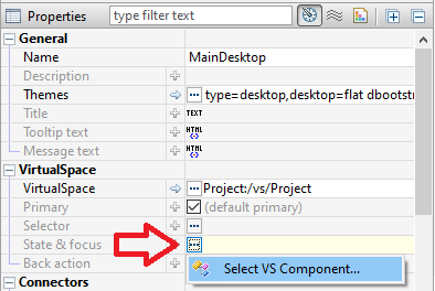
- Click the more
…buttonin the value field of the VirtualSpaceproperty of the Panel.

Connect a panel to VirtualSpace from the property editor.
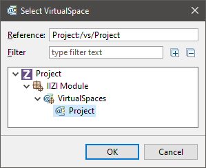
Select to connect to a VirtualSpace by either
creating oneorselecting a VirtualSpace.Create a
vsFieldin the VirtualSpace Editor.

Connect a component to a VirtualSpace entity from the property editor.
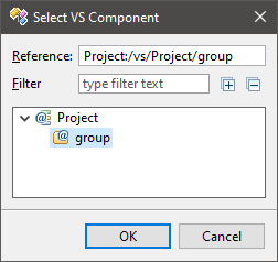
Connect the
componentto thevsField.Click the more
…menu in the value field of thevsActionpropertyto create a vsActionorconnect to an already existing.

The vsAction property under Actions in a button component’s properties.
The VirtualSpace supports drag and drop of itself and its components using the Link operation. You can create a connection between the drag-dropped elements and the destination; the destination can be a Panel or its components, a Data Connector or its data input or output.
3.3 - Editor and tools
VirtualSpace editor and tools
The properties shown in the VirtualSpace Editor depend on the selected VirtualSpace entity type – all VirtualSpace entities have the states Enabled, Read-only, Visible and Selected. By default, they are all Enabled and Visible, not Read-only and not Selected. The value of each VirtualSpace entities can be changed depending on the type of data in the editing pane at the bottom right – specialized for each component.

The VirtualSpace Editor
Edit values for VirtualSpace entities
- The
vsFieldhas aValue editorthat better shows all the value settings:

- Type: the datatype of the value,

- Null: if the value is Nullable or not (clicking on
Null hyperlinkwill set the value tonull),

- Value: entry field to enter the value in a string that can be parsed by the value type in question without pattern, e.g.
0for a Double,P2DT3H4Mfor a Duration of 2 days, 3 hours and 4 minutes,12:45:56for a LocalTime value,

- Pattern: the pattern to use for the formatter of the value type, e.g.
#,##0.00;(#,##0.00) for a number with 2 decimals displayed as (123.45) when negative,hh’o”clock’ a, zzzzfor a date as 12 o’clock PM, Pacific Daylight Time,


- Use tag processing: use this option to enable the plain string entered as pattern to accept tags to reference a text table for special localized patterns depending on the language used for the client session.

- Locale: combobox used for testing purposes to see how a value would look like in a specific locale. The tooltip of the Value entry field shows a preview of the value with the pattern in the specified locale; you can also toggle the preview to always be shown.

3.4 - Field Actors
VirtualSpace field actors
The Field Actors are used for three purposes: conversion to a Value
from a native value, conversion from a Value to a native value, and validation. They are written in a Java class and are intended to be re-used in many parts of the application as required. The native value is the value used for the conversion, generally String or KString, but supports any Java Object. The validation is done on the Value itself (i.e. has already passed the conversion stage to a Value).
The VSFieldEvent parameter has access methods to what you need to perform the task, and is also used to set a validation message for conversion or validation failures.
The actor is an instance method of a name of your choice, annotated by @OnVSField in the class that is attached to the namespace, or it can be a static class located in Java libraries (Jar files) or other Java projects annotated with @OnVSFieldStatic.
Example of namespace class instance:
package mypkg;

import com.iizix.api.vs.OnVSField;
import com.iizix.api.vs.VSFieldEvent;
import com.iizix.api.vs.VSFieldEvent.Category;
import com.iizix.api.vs.VSFieldEvent.Op;
import com.iizix.api.vs.VirtualSpace;
import com.iizix.text.KString;

/**
 * JavaDoc shown in tooltips when hovering mouse over the class reference.
 */
@VirtualSpace(ref = "FirstProject:/vs/start")
public class StartNameSpaceListener {

    /**
     * This JavaDoc is shown in when hovering mouse over a method reference.
     *
     * @param event
     *            The VS Field event.
     */
    @OnVSField(name = "fld", descr = "MyFieldActor ABC 123", ops = { Op.VALIDATE },
               source = { String.class })
    public void onField(VSFieldEvent event) {
        Object value = event.getConvertedValue();
        if (value instanceof String) {
            // Do your validation.
            String s = (String) value;
            if (s.equals("123")) {
                event.setMessage(
                        KString.newPlainKString("123 is not a valid value"),
                        Category.WARNING);
            }
        }
    }
}
In the context menu of the field actors, select New Field Actor, then the dialog box will list all available methods from the namespace attached class, and those that would match that are on the project’s classpath (including static methods in libraries and other projects):

When you select a method in the list, its description taken from the descr = "string" of the method annotation. When you close the dialog box, the tooltip of the field actor could look like:

3.5 - How VS works?
How VirtualSpace works?
How VirtualSpace works? (Same VS)
There is a tutorial video just down below.
You need a QuickStart project:
- Select
File > New > IIZI Module Project (Quickstart) - Enter
project nameand unselectCreate text tables with automatic translation - Press
Finish
- Select
Right-click to
desktop package in Panels- Select
New > Panel… - Set
a name> Then selectNext - Select
your panel type and your initial layout - Then select
Next - Select
your user interface type and your theme here - Then click on
Finish
- Select
Go to your
VirtualSpace- Add
VS Group - Try to use
same nameas your panel
- Add
Go back to your
Panel’s properties- Click on
State & focus > Connect to VirtualSpace… - Select
your VirtualSpace> Then clickOK - Click again on
State & focus> SelectVS Component… - Select
your VS Group> Then clickOK - OPTIONNAL: You can add new label to this panel.
- Click on
Go back to your
MainDesktop panel- Add
buttonand go to button properties:- Add
your panel name in Text - Click on
VS Focus - Select
VS Component reference to focus… - Select
VS Groupof your new panel
- Add
- Add
Then do
File > Save AllorCTRL + SHIFT + S- Right click on
project name > Run As > Run on IIZI Development Server - If it says “No configured IIZI Development Server configuration is found”: Choose
Yes. - Right click on
IIZI Development Server > New Configuration > Add a Configuration Name > Run it
- Right click on
To test it:
- You need to
open your browserand go to: http://localhost:8080/ - Click on the link:
here - Then click on
Startto launch the app in the browser. - You just click on
the buttonand it will go to your new panel.
- You need to
How VirtualSpace works? (Separate VS)
There is a tutorial video just down below.
You need a QuickStart project:
- Select
File > New > IIZI Module Project (Quickstart) - Enter
project nameand unselectCreate text tables with automatic translation - Press
Finish
- Select
Right-click to
desktop package in Panels- Select
New > Panel... - Set
a name> Then selectNext - Select
your panel type and your initial layout - Then select
Next - Select
your user interface type and your theme here - Then click on
Finish
- Select
Go to your
Panel's properties- Select
VirtualSpace > Create new VirtualSpace... - Set
a name> Then selectFinish
- Select
Go to
your new VirtualSpace- Add
VS Group - Try to use
same nameas your panel
- Add
Go back to
your Panel's properties- Click on
State & focus > Select VS Component... - Select
your VS Group> Then clickOK - OPTIONNAL: You can add new label to this panel.
- Click on
Go back to
your MainDesktop panel- Add
buttonand go tobutton properties:- Add
your panel name in Text - Click on
VS Action - Select
Create VS Action... - Set
a name> Then selectFinish - Double-click on
VS Action's propertie
- Add
- Add
Click on
Target VirtualSpace- Then
Select VirtualSpace... - Choose
the other VirtualSpace
- Then
In the Action definition part:
- Select
Action Actors - Right click >
Add > Set focus - Click on the
Target focus - Then Select
VS components reference to focus... - Choose the
VS Group you want - Then do
File > Save AllorCTRL + SHIFT + S - Right-click on
project name > Run As > Run on IIZI Development Server - If it says “No configured IIZI Development Server configuration is found”: Choose
Yes. - Right click on
IIZI Development Server > New Configuration > Add a Configuration Name > Run it
- Select
To test it:
- You need to
open your browserand go to: http://localhost:8080/ - Click on the link:
here - Then click on
Startto launch the app in the browser. - You just click on
the buttonand it will go to your new panel.
- You need to
How to change the app default VirtualSpace Focus?
There is a tutorial video just down below.
You need a QuickStart project:
- Select
File > New > IIZI Module Project (Quickstart) - Enter
project nameand unselectCreate text tables with automatic translation - Press
Finish
- Select
Right click on
your project nameSelect
Properties- Go to
IIZIthenApp - On
Startup > Focusthen click... - Click on
Select VS component reference to focus... - Choose the
VS Groupyou want to set as default - Then click
OK - Finally click on
Apply and Close
- Go to
How VirtualSpace works with multiple devices?
There is a demo video to show you how VirtualSpace is works with multiple devices connected.
3.6 - Table editor
VirtualSpace table editor for the vsTable entity
The vsTable is special among the VirtualSpace entities and should be used to connect data tables, lists and other collections. The Table editor pane shows the table columns and rows:

The VirtualSpace vsTable editor and toolbar.
All tools available to manipulate rows and columns are in the toolbar or in the context menu. Columns are drag-drop movable using their headings to reorder columns; you can also reorder multiple columns from the VirtualSpace Editor tree-table. Rows and columns can also be moved with the arrow tools. Double-click on a cell to edit its value.
When a column is selected, the Column Field Actors are displayed and can be edited. These actors provide the same functionality as the Field Actors, but are the definition of the column that is applied to all its cells (fields). The entry fields just above the table are used for, one filter per column, and the rows shown must match all defined filters.
4 - Starting UI design and UI creation
Starting UI design and UI creation
NEED TO BE DONE
4.1 - Start with UI
Start with UI
If your web application requires designing the UI first, iiziGo provides a comprehensive drag and drop UI builder with an extensive list of UI components. No JavaScript or HTML development is required.
Your user interface builder in iiziGo is the Panel Editor and is based on the Panel Container. The Panel is always a main container for a view and will be the root container for UI components; each Panel can be thought of as a page. Having created your new project with Quickstart, there are already several Panels created for you. Start with the mainPhonePanel or mainTabletPanel by double clicking it in the IIZI Explorer.
Components are selected by clicking on the component’s name in the Panel’s tree view or by clicking the component directly in the Design Editor. Multiple components are selected by using ctrl-click or shift-click. The Panel organizes its children and resizes in strict accordance with its Layout Manager. It is important to remember that a component’s available properties are also determined by the Layout Manager of its parent container.
4.2 - Layout managers
Layout managers
When using Quickstart, a Layout Manager is automatically assigned to the three main panels in three separate panel subfolders. When creating new Panels, you must assign a Layout Manager for your new Panel in the New Panel Wizard. There are four possible layouts:
Flex Layout (Not added here)
For more information on Layout, see Layout section.
Layout
You apply a Layout Manager to a Panel or other container to control the position of its child components. The available layouts are Absolute, Border, Grid and Flex. When creating a Panel or container you are given the choice of Layout Manager in the New Panel wizard or New Container wizard. You can also select the container and click the Layout tool in the Panel Editor toolbar. Some containers have an explicit Layout Manager already assigned and in these cases the Layout tool is disabled.

Layout options tool in the panel editor toolbar
Absolute layout
Absolute Layout will position and size children according to absolute values relative to the container. Minimal and maximum sizes and component alignment can be defined. Position and size properties are available under Layout properties for both the container and for individual components in the Property Editor. Click to view or double click the Layout button in the Property Editor tool bar to isolate the Layout properties. Components in the Absolute Layout have the following Layout properties:

Absolute layout properties in property editor
To achieve a responsive design with Absolute Layout, percentages can be used in Left, Top, Width, and Height values. The Property Editor also accepts percentages in combination with pixel values. For example, a component can be given a Top value of 50% minus one half of its width, to keep it in the vertical center of its parent container regardless of the containers size and shape.
Border layout
The Border layout will always stretch to fill its parent container; the Border layout will position components in the five defined regions of Top, Bottom, Center, Right and Left (Leading and Trailing are also defined for RTL language design). Visual hints are provided when dropping a component into a container with Border layout. Multiple components can be placed in the same region.

Layout regions appearing in a container with border layout
Click or double click the Layout button in the Property Editor tool bar. Components in the Border Layout have the following layout properties:

Border layout properties in property editor
The regions can be resizable at runtime by setting the Resizable property. The following values are only meaningful when the Resizable option is used: Define the limits for how small and how big with Minimum size and Maximum size as well as the initial size Width and Height.
The properties defining how the container should behave are the following:

The top and bottom regions extend the entire width of the container and the remaining regions are placed in the middle. With the left and right (or leading and trailing) regions, the side regions take priority, extending the full height of the container. If the Gutters property is defined, the regions will have spacing between. The Live resize property will allow the regions to be resized at runtime.
Grid layout
The Grid Layout arranges components in rows and columns. The properties defining the Grid Layout are the following:

Grid layout properties in property editor
The number of columns is defined and the number of rows is then calculated as depending on the number of components added. The Same width and Same height properties specify whether the columns and / or rows should be distributed evenly in the Grid. The Cell spacing and Cell padding can be defined and will then be applied for all cells in the Grid.
The potential overflow of the Grid container’s content is determined by the Horizontal and Vertical align properties.

Detail of Grid layout properties that control content and grid overflow
When dragging a component over a Grid layout container, the container displays visual hints for positioning the component. Depending on the settings mentioned above, the Grid will adapt to the new components, potentially adding rows and columns.

Grid cell regions that appear in a container with Grid layout
Another way to design the structure of the Grid is to use the Grid layout actions tool in the toolbar. If the container is not empty, the way in which the newly introduced components should relate to earlier components can be specified in the Distribute dropped components menu in the toolbar.

Component distribution options tool in the panel editor toolbar.
4.3 - Create components quickly
Create components quickly

Drag and drop components from the component tool bar, or right-click in the Design Editor and choose from the complete component menu. You can also right-click in the Panel Editor tree view and choose from the same menu.

The placement of a component behaves differently depending on the Layout Manager assigned to your panel.
Once created, the component’s default properties will appear in the Panel Properties. To set default properties on components before they are created, right-click the component in the toolbar and choose Edit default properties.
4.4 - Data-oriented components
Data-oriented components
Upon creation of components that require data connections, you will be guided to connect the component to an existing VirtualSpace, and to create a vsField, vsTable or vsAction entity for that VirtualSpace.

Name your VirtualSpace entities as you would variables and fields in Java code (for e.g. vsMyAction); a vs prefix will help keep your application organized and make VirtualSpace entities easily distinguishable from Java fields and UI Component names.
4.5 - The Property editor; base, layout and styles
The Property editor; base, layout and styles
With a component selected, you will find all the component’s properties listed in the Property Editor. The properties of a component are divided into Base properties, Layout properties and Style properties. You can view all these at once or double-click one of the three buttons in the properties tool bar to isolate a group of properties. You can also find any property quickly with the search field.

The Property Editor toolbar
Use the Property Editor to change the properties of your components in real time and to apply all component designs as you would when writing CSS. With a Panel or any of its components selected, you will find all necessary tools for manipulating properties and attributes in the Property Editor and the Panel Editor toolbar.

The Panel Editor toolbar
Quick UI Primer
I hope Heading 1 is OK and the rest Heading 2 will also be OK, otherwise decrease…
Type and text
You cannot type directly into any of the text components in the Design Editor. It is recommended to store all your app’s dynamic and static text in a Text Table. Text can also be entered in the text property under Panel Properties > Text for all text components, or double-click the text properties value field to open a text editor or text table editor.
Selection
All Base, Layout and Style properties are context sensitive to the component selected. Multiple component selection is supported for properties shared by multiple components. You can select a component in the Panel’s component tree list, or in the Design Editor.
Bounding Box
The component’s Bounding Box serves as a resize box only if the component’s Horizontal and Vertical aligns are set to fill; these are found in the Layout properties. Otherwise the Bounding Box can be larger or smaller than the component, allowing you to align the component within the Bounding Box.
Width, Height, Left and Right
Most of the time it is not recommended to assign width and height to components in iiziApps. As with all responsive UI design, the layout is device-dependent; the Layout Manager in iiziGo will handle position and resizing of your components.
Duplication
All components can be copied and pasted either from the component list in the panel tree or in the Design Editor. Right-click a component and choose Copy; you can then Paste it and all its properties into the same Panel or into any other Panel in your app.
4.6 - Improvising HTML and CSS
Improvising HTML and CSS
Although the JavaScript code, HTML and CSS markup are hidden from you, if you cannot adjust or skin a component to your liking in the Property Editor, you can add HTML to all components that have text fields by using IIZI KStrings. This includes adding a <div>, <span> or <style> tag.

4.7 - Choosing a device list, device orientation and zoom
Choosing a device list, device orientation and zoom
The Design Editor shows a live instance of the Panel and its components. This means that any change in a component’s properties and hierarchy will be visible immediately. Likewise, any change in the Design Editor will be immediately reflected in the Panel’s properties. It is recommended to use 100% view under the Zoom option in the Design Editor menu bar (1. on image); test your Panel’s design in portrait or landscape instantly using the device Orientation option (2. on image), and compare your Panel’s design on other devices using the simulate device option (3. on image).

The iiziGo Design Editor Toolbar
4.8 - A note on Responsive design
A note on Responsive design
Finding the best UI experience on mobile and desktop, in both portrait and landscape and across all mobile devices is an art. All Layout Managers offer ways to achieved responsive design. The iiziGo design workbench offers Responsive horizontal and Responsive vertical properties of components when placed in the Absolute Layout. This feature allows a component to be assigned a different size or position when the device orientation is changed.

An example of layout properties for a component in Absolute Layout
With a Border Layout, you must assign components a region property of value: top, center, bottom or left and right. These regions resize in relation to one another when device orientation is changed. Responsive design for mobile devices can also be achieved by working with IIZI selectors. Selectors can be set on the Phone and Tablet packages in your easy project, as well as for portrait and landscape for any given Panel, by creating and assigning selectors to portrait and landscape packages. For a full description of how to use selectors, see section Selectors of this chapter.
4.9 - Locking orientation for Mobile
Locking orientation for Mobile
If you wish to develop your mobile app for portrait only, or landscape only, the IIZI API provides Java methods setOrientation and unlockOrientation which can be called on a VirtualSpace event or a Panel’s onUICreate event. You can decide when to lock or unlock the orientation of your app, either at the start of the application or for any Panel.
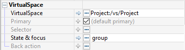
4.10 - Connect to a VirtualSpace
Connect to a VirtualSpace
Later, you will connect your Panels to a VirtualSpace and connect components to vsFields in the Panel’s corresponding VirtualSpace. Select a Panel in the Panel’s tree-list and explore its properties in the Property Editor. Note the property Primary under Base > VirtualSpace > Primary; this is a boolean which must be true for only one of your Panels. Keep this property unchecked – secondary – for all other Panels.
Once you have placed components into a Panel, you are ready to connect the Panel and its components to a VirtualSpace. Connection to the VirtualSpace creates the variable-data binding that enables the component to perform actions in the application context, update instantly, present and edit data.
If your Panel is not connected to a VirtualSpace, select your Panel in the Panel Editor tree view and under the Panel Properties, click the … menu and choose Select VirtualSpace.
After this, you can click on State & focus and choose Select VS Component.
You can similarly connect any UI Component to a vsGroup, vsField or vsTable.
5 - Starting data first
Starting data first
NEED TO BE DONE
5.1 - What does starting data-first mean?
What does starting data-first mean?
If your app requires that you start from your data provider first, iiziGo provides the Database Data Connector for connecting transactions with the VirtualSpace. The iiziGo plugin utilizes Eclipse Data Tools Platform (DTP), while the iiziServer uses a direct JDBC implementation. Make sure that the Module project has the Database connector plug-in enabled to define a new Database Transaction (DB Transaction).
To enable the database connectors:
Right click your project folderin the IIZI Explorer and selectProperties.- Tick
Database connectorandApply and close.  will appear in the IIZI Explorer.

5.2 - How to use a Database?
How to use Database?
Create a new Database
Create a new Database Transaction using the New Database Transaction Wizard.
Above the BIRT sample database is used, and is available through Help > Install New Software (and select category Business Intelligence, Reporting Tools = BIRT).
Select New to add a new Connection Profile.
NEED IMAGE HERE
Connect to an existing Database
Before a database transaction can be created, a Connection Profile needs to be created. It contains information that specifies the JDBC driver and parameters, database name and location, and sometimes a user account for accessing the data.
5.3 - Database editor
Database editor
The Database Editor consists of an SQL Builder that helps you build your query statement. On the left of the Database Editor, you define the properties for the Input and the Result and the connections to a VirtualSpace.

Database Connector editor
SQL Builder
The top-right entry field is used to input or build the SQL query statement. The right-middle area is used to specify the tables and columns and to create join’s. The right-bottom part specifies sorting, conditions, grouping, etc.
5.4 - Database transaction types
Database transaction types
The SQL Builder supports the SQL Query Statement types SELECT, INSERT, UPDATE and DELETE. If the statement syntax does not match these types, the SQL builder helper parts are disabled. The SQL syntax is always verified and errors are shown with red squiggly underlines. Hover the mouse over this location to display a tooltip which will indicate the current problem. To re-enable the SQL Builder, correct the SQL syntax and make sure to have the correct types that are listed above.
Select the context menu item Omit Current Schema, followed by selecting the checkbox for SQL statement generation:

Omit Current Schema
Statement generation for database connector
SELECT
  EMPLOYEES.EMPLOYEENUMBER,
  EMPLOYEES.LASTNAME,
  EMPLOYEES.FIRSTNAME,
  EMPLOYEES.JOBTITLE
  FROM EMPLOYEES
    JOIN OFFICES
      ON EMPLOYEES.OFFICECODE = OFFICES.OFFICECODE

Database connector editor
As the statement builds up, the left side will show the result set columns with the SQL datatypes.
5.5 - Connect to a VirtualSpace
Connect to a VirtualSpace
Once you have connected to an existing database or initiated a new iiziDatabase for your iiziApp, you are ready to connect to a VirtualSpace. The data can be efficiently coupled to a vsTable once a VirtualSpace is connected to your Input and Result Set. In the Database Connector Editor, specify the VirtualSpace connection for the Input variables and Result set.
In our example the same VirtualSpace is used for both input and output, here named start, but the result could be placed in a different VirtualSpace. To view SQL Results, right-click in the query statement editor and select Run SQL, and the SQL Results view located at the bottom pane in the workspace will show the following:

SQL Results view
5.6 - VirtualSpace Table creation
VirtualSpace Table creation
Now that results are present, the VirtualSpace Table can be created and connected to the columns using the tool:  Wizard to create the
 vsTable, the columns and the connections. Click on the table creation wizard to open a prompt to create the table with 4 columns named as the database columns; if asked to open the VirtualSpace, reply No. The database editor tree now shows the connection of the result to the table and columns instead of the VirtualSpace.

Database connector editor tree view
Now select the populate table tool:  Populates the connected vsTable with the rows of last result set.
The tool will ask you to populate twenty-three rows in the vsTable, and although it prompts you to go to the vsTable, select No. Hover the mouse over the table or over the columns in the VirtualSpace reference column to display the tooltip. The tooltip for the vsTable also displays the first five rows and the connections. By carefully moving the mouse into the tooltip – to avoid dismissing it – you can select a column header in the table. This will open the VirtualSpace Editor and focus the selected column.

VirtualSpace table editor
5.7 - Web Services
Web Services
The Web Services data connector connects web services with VirtualSpace Fields and Tables as a web service consumer.
There are currently two supported web services types:
- RESTful (REpresentational State Transfer) using URL encoded parameters, and
- SOAP (Simple Object Access Protocol versions 1.1 and 1.2) using WSDL definitions.
The RESTful type is typically used for “simple” stateless services, whereas SOAP using WSDL is formal and more complex, also providing XML Schema validation of requests and replies.
The REST services are more unpredictable than SOAP services as the reply can vary both in format and contents in many cases. The positive about REST is that the services generally are simple, easy to use and fast to implement. It is not the necessarily the service architecture that makes it so, often it is just the fact that the services are not so complex.
Make sure that the Module project has the Web Services connector enabled in order to be able to define a new Web Service.
The folder used in the Module project is  .
.
Web Services Editor
The Web Service Editor is divided into two areas; the left side is used for the request, i.e. for all parameters that makes up what is going to be sent to the remote party, and the right side for the remote reply that is received.
The top part of each area consists of a tree structure of the request and the reply respectively. The bottom part contains a property editor to edit the selected item in the tree of the same area.

REStful web service
A RESTful web service is created using the New Web Service Wizard, and currently only supports URL encoded parameters. This web service type is using the HTTP protocol and can be secured with SSL. The parameters are sent either in the request URL as e.g. http://url/path?p1=abc&p2=def or in the request body for larger data, using the HTTP methods GET, POST, PUT or DELETE.
Using the database analogy, the methods corresponds as Get = select/read, Post = update, Put = insert/create and Delete = delete.
The RESTful web services properties for a request are:
- URI:
Defines the web service URI including protocol, port specification (if required), but without the query (or parameters) part that starts with a question mark (?).
- Method:
Select the HTTP method to use, i.e. one of GET, POST, PUT or DELETE.
- Override method:
Specifies the method that overrides the request. Certain services (e.g. Google) uses a POST method overridden by a GET. In this case, specify GET as the overriding method. This technique is sometimes required to provide additional data that can be limited with e.g. the GET request.
- Encoding:
Specifies the encoding for the parameters, default is UTF-8.
- Read timeout:
Sets the maximum read timeout in milliseconds for the socket connection and is used to control the response time. The default value is 20000, i.e. 20 seconds. If a reply is not received within this time, the web service request fails with a timeout.
- NameSpace:
Sets the namespace to use for the input parameters. All input parameters must be located in this namespace (but the input and output namespaces can be different).
- Class:
Used for advanced processing, building and/or manipulation of the request. The class must implement the interface iizix.ws.api.IRESTfulRequestProcessor. It has a single method that is called prior to formatting the web service request, enabling e.g. fetching a Token that is used in the request to identify the requestor. See the JavaDoc of the interface for more information.
Creating a request
A free and public web service that gets the geolocation of an IP address is used in this chapter (see http://www.hostip.info/use.html for more information).
Fill in the request parameters as shown below:

In this case, the JSON reply format is chosen due to get_json.php
(the path defines JSON for this service). The VirtualSpace start is also connected to the request.
6 - Starting Java business logic and IIZI Development
Starting Java business logic and IIZI Development
What does it mean?
If your web application includes Java code from a previous project or has been partially developed in another IDE, you can paste your Java code and folder structure into iiziGo after creating a new IIZI Quickstart project. During deployment for distribution, all directories and libraries are packed into your iiziApp.
Having started with Quickstart, a main Java class is created for you in the src package. This has been named with your IIZI project’s name, and contains the minimal IIZI Annotations necessary for integrating your Java code into your iiziApp; you can connect your Java project through this class. At present – version 1.0 – only one Java class can serve as the annotated entry point for a VirtualSpace or a UI Panel.
@VS (ref= "MyApp:/vs/start")
public class StartNameSpaceListener {

  @OnVSChange (name="fld")
  public void onChange (VSChangeEvent event) {
  }

  @OnVSFocus (name="input")
  public void onFocus (VSFocusEvent event) {
  }

  @OnVSAction (name="my-Action")
  public void onAction (VSActionEvent event) {
  }
}
A Java class annotation and three annotated Java methods
All references to IIZI elements are made using a reference path name in the following format: module:/path/name. Java code is updated and changed using Eclipse refactoring mechanisms whenever required.
Your Java classes can be annotated to a VirtualSpace directly while your Java methods will have annotations to VirtualSpace entities. In the IIZI Platform you do not normally add the listeners that are common in UI programming; instead, you connect a method to the place requiring the specific functionality.
6.1 - Java class and method connections
Java class and method connections
[Need a Text update on bottom]
There is a tutorial video just down below.
Your Java code can be connected to the VirtualSpace through a Java class that uses the IIZI Annotations for Java shown above.
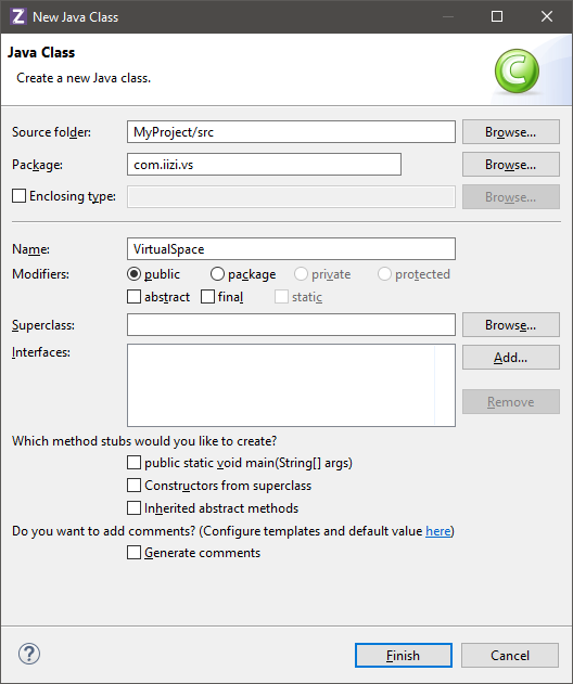
Creating annotations for a class is automatic when you create a class through the Java Class property in the Property Editor. The IIZI Annotation is created with the class. With this automated approach, iiziGo has already created a back reference for the VirtualSpace participant.

Creation of a new Java class for a VirtualSpace
Creating annotations for a method is also automatic when you create a method through the properties of a VirtualSpace entity in the VirtualSpace Editor. In the example below, the method will be connected to the OnVSChange property of a vsGroup. The IIZI Annotation is created with the method, and the method is created with the correct Java Method Signature. With this automated approach, iiziGo has already created a back reference for the VirtualSpace participant. It is recommended to use Ctrl-shift-S, Save All, frequently, as you make major changes to your Panels, Text tables and VirtualSpace entities. This will enable iiziGo to update the many references needed to maintain live connections between your source code, Panels and VirtualSpace.
We need to add texts here !!!
6.2 - VirtualSpace Actions and Java methods
VirtualSpace Actions and Java methods
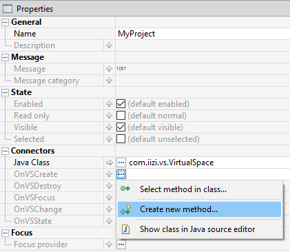
UI components with click action events, typically buttons or menu items, have a VS Action property listed under Action in the Property Editor. For common interactions between components and Java methods, create a vsAction in your VirtualSpace and connect the vsAction to your Java method.

Creating a vsAction on a UI component through the component’s properties view
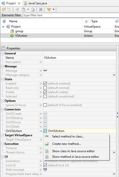
With the vsAction selected in the VirtualSpace Editor, search the Property Editor for the Connectors section; here, in the value field of the OnVSAction property, click the more … menu and select a Java method or create a new method.

Create or assign a Java method to a vsAction in the properties view of the VirtualSpace editor
6.3 - Attaching methods to VirtualSpace entities
Attaching methods to VirtualSpace entities
You can attach a Java method to react to any changes in a VirtualSpace entity’s instance value, as well as any changes to its state, by specifying a method name for OnVSChange. To listen to focus changes, use OnVSFocus. The method name specified must be present in the class that is attached to the VirtualSpace. You chose the method name, but your custom method must have the respective Java Method Signatures:
@OnVSChange(name="componentPath")
public void onChange (VSChangeEvent event)

@OnVSFocus(name="componentPath")
public void onFocus (VSFocus event)
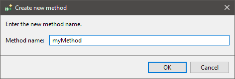
The method name editor has a more … button that drops down a menu to help you to create a new method, to select an existing method, or to define or fix the method annotation with the correct componentPath.
6.4 - Attaching methods to VirtualSpace events
Attaching methods to VirtualSpace events
A Java method and its annotation are automatically created when adding a method to the VirtualSpace event in the VirtualSpace Property Editor. In this example, we will attach a method to the OnVSFocus First assign a vsGroup to the state and focus property of a Panel. With the vsGroup selected in the VirtualSpace Editor, the Property Editor displays the Connectors section in which you can choose from the following events: OnVSCreate, OnVSDestroy, OnVSFocus, OnVSChange, and OnVSState. By clicking the more … button to the right of the OnVSFocus property, you can create a new Java method – with the correct annotation – that will be called every time your Panel gains focus or loses focus.
Below is a simple Java method created through the Property Editor to react to the OnVSFocus event. The method tests the property isFocusGained in which the IIZI API method setScreenOrientation is called. For the inverse case, when focus is lost, the unlockScreenOrientation method in called. Notice that the main VirtualSpace itself is referenced in the Java class, and that the client session is accessed by a reference to the IIZI Client Gyro.

Create or assign a Java method to a vsAction in the properties view of the VirtualSpace editor
6.5 - Back reference problems
Back reference problems
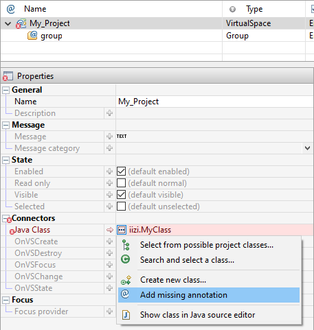
When connecting a method or class to the VirtualSpace from the Java code editor, the back reference will be missing. In this case – and at any time you find that a back reference is missing – one can be added by opening the VirtualSpace and selecting the back references enable clean debugging while in development.
You can add any missing annotation from VirtualSpace and panels to the code by:
Adding missing annotationFile > Save allor useCTRL + SHIFT + S
6.6 - UI Annotations
UI Annotations
Another form of annotation that exists in iiziGo is the UI Annotation. To access any of the UI Component Events in your Java code you must first set the Events property on the component’s Panel. A UI Annotation will be added to your Java class. Then you can set a Java method to respond to any of the familiar UI events by assigning a value to a component’s UI event. A UI Annotation will be added to your Java Method.
Creating or selecting Java methods through a component’s Events property
In the following example, we will add a Java method to the UI Event, OnUICreate; our method will lock the mobile device orientation when the Panel is created. A Java method and its annotation are automatically created when adding a method to a UI Event in the Panel’s Property Editor. With the Panel selected in the Property Editor, the Property Editor displays the Events section in which you can choose from the UI Events listed above. By clicking the more … button to the right of the OnUICreate property, you can create a new Java method – with the correct annotation – that will be called when your Panel is created. And by doing the same when it is destroyed. Notice that the client session is accessed on the event by a reference to the IIZI Client Gyro.

Creating classes in the panel’s property editor
Common UI Events
| OnUICreate | OnUIValueChange |
|---|---|
| OnUIDestroy | OnUIAction |
| OnUIConnect | OnUISelection |
| OnUIBack | OnUITextChange |
| OnUIFocus |

Creating or selecting Java methods through a component’s Events property
In the following example, we will add a Java method to the UI Event, OnUICreate; our method will lock the mobile device orientation when the Panel is created. A Java method and its annotation are automatically created when adding a method to a UI Event in the Panel’s Property Editor. With the Panel selected in the Property Editor, the Property Editor displays the Events section in which you can choose from the UI Events listed above. By clicking the more … button to the right of the OnUICreate property, you can create a new Java method – with the correct annotation – that will be called when your Panel is created. And by doing the same when it is destroyed. Notice that the client session is accessed on the event by a reference to the IIZI Client Gyro.
A Java methods for locking screen orientation triggered by the UI events
/***
* Auto-generated OnUICreate for panel or its components.
*/
@OnUICreate(name="nameOfPanel")
public void onUICreate (UICreateEvent event) {
  ScreenOrientation lockPortrait = ScreenOrientation.portrait;
  event.getClientSessionGyro().setScreenOrientation(lockPortrait);
}
/***
* Auto-generated OnUICreate for panel or its components.
*/
@OnUIDestroy(name="nameOfPanel")
public void onUIDestroy (UIDestroyEvent event) {
  virtualSpace.getClientSessionGyro().unlockScreenOrientation();
}
6.7 - Location of code
Location of code
The application code can reside in Module projects, Java projects, libraries and directories. When the application distribution is created, it is packed into a single iiziApp using the Application Distributor, see separate chapter.
Java code plays an important role in for an iiziApp. To build application logic into the iiziApp, it needs to refer to various parts. All references to IIZI elements are done using a reference name that looks like module:/path/name. This reference can have the module defined as “.” to refer to the current project where the Java code resides.
6.8 - Available APIs in iiziGo
Available APIs in iiziGo
The many methods exposed by the IIZI Platform API are available to you through Eclipse’s Java code completion. The IIZI Core and Plugin Libraries are not visible in the iiziExplorer, but only in the Eclipse Java Perspective. For the complete IIZI Platform Java API Specification see the IIZI Java API reference at https://support.iizi.co.
You can also access the JavaDoc from your local installation, generally using port 2800 using the link http://localhost:2800/ and selecting the JavaDoc link on the displayed page.

7 - Selectors
Selectors
What is a Selector?
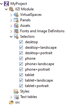
A Selector is a short expression that allows your application to easily identify devices; these IIZI Selector Expressions are kept in your project’s Selectors folder. Comparable to CSS media queries, your Selectors handle device change, device capability, and much more. You define a Selector and then apply it – in your applications Project view – to either the Module project, a package, or directly to a Panel. Having created your project with Quickstart, several Selectors have been written for you and stored in your project’s Selectors folder.
Create a new selector using its wizard. The selector editor is used to define the Boolean Selector Expression.
7.1 - Anatomy of a Selector expression
Anatomy of a Selector expression
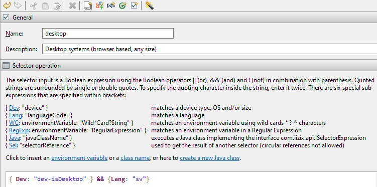
The Selector is made up of one or more function tags written inside curly brackets { } that begin with one of the six keywords: Dev, Lang, WC, RegExp, Java, and Sel
, followed by a colon. Each keyword enables you to make different types of matches; it is possible to match devices, device capabilities, environment variables, language, and changes in geographical locations. A Selector may also refer to another selector expression that has been defined in the same or another Module project.
TODO Describe language.
| Syntax | Description |
|---|---|
{ Dev: "device" } | Matches a device type, OS and/or size. |
{ Lang: "languageCode" } | Matches a language. |
{ WC: environmentVariable: "Wild*Card?String" } | Matches an environment variable using wild cards * ? ^ characters. |
{ RegExp: environmentVariable: "RegularExpression" } | Matches an environment variable in a Regular Expression. |
{ Java: "javaClassName" } | Executes a Java class implementing the interface com.iizix.api.ISelectorExpression. |
{ Sel: "selectorReference" } | Used to get the result of another selector (circular references not allowed). |
The predefined functions are written inside curly brackets { }. To edit a selection of e.g. a device match, double-click on the expression. The selection dialog box will then be shown.
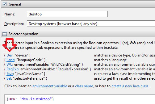
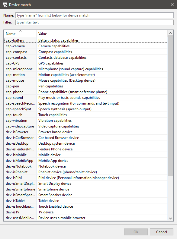
If you place the mouse over an expression, a tool tip will be displayed that displays a summary of the expression and the match value of the last device that accessed the internal IIZI server. If no device accessed it, the values will be matched against the Eclipse-internal browser, e.g. Internet Explorer for Windows.
{Dev: "orient-portrait"} && {Dev: "dev-isSmartphone"}
Example of a selector expression with function tags and boolean operators.
The second part of the tag is a selector property within single or double quotes. These bracketed function tags are joined together by Boolean operators to create a boolean selector expression called an IIZI Selector Expression.
7.2 - The Selector Editor
The Selector Editor
Create a new Selector by right-clicking the Selectors folder and choosing New Selector. When finished, the Selector Editor will open in a new Tab. You can also open the editor at any time by double clicking a Selector in the Selector folder. The six available keywords are listed in the Selector Editor where you can click any keyword to open a comprehensive list of all properties. The editor writes IIZI Selector Expressions and you choose from the available properties.
The Selector Editor has toolbar that allows you to define an input device to test against your new expression. The default input device is the last device connected to iiziGo. The editor instantly tells you if your expression finds or fails to find the device.
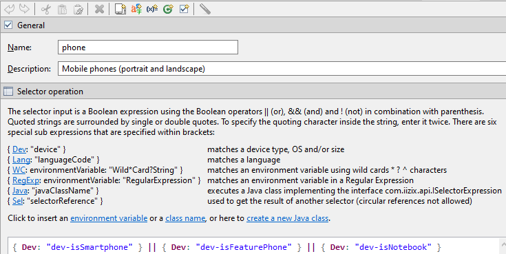
The selector editor and its toolbar with example of an IIZI selector expression.
7.3 - Using Selectors
Using Selectors
Perhaps the most common Selector is the device match, Dev, used to match a feature belonging to the end-user device. The available device properties are divided into the following feature groups with the following prefixes: Capabilities cap, Orientation orient, Size size, Type type and Operating System os. A selector expression with Dev is used to provide a UI design that matches a device, a specific device capability, device type or device operating system.
There are two ways to match environment variables using either the Wild Card WC, or RegExp to match an environment variable in a regular expression. Selector expressions using an environment variable can be used to find progressive devices such as wearables and WebTV.
Further customization is possible through selector expressions using the Java keyword that allow you to direct your application flow through a custom java class designed to handle advanced or unknown devices. The Selector editor will create a Java class for you or guide you to connect an existing class.
7.4 - Device match
Device match
The Device match expression is used to match a feature from the end-user device. It is divided into the feature groups Capabilities, Orientation, UI Theme, Size, Type and Operating System. This selector expression is used to provide a UI design that matches the device, e.g. you do not wish to display a panel that wants to record a video when the device doesn’t have this capability, you have a very dark panel that would suit the Android theme, or that you have two versions of a specialized panel depending of the device orientation.
The dialog box below shows all the current matches available:
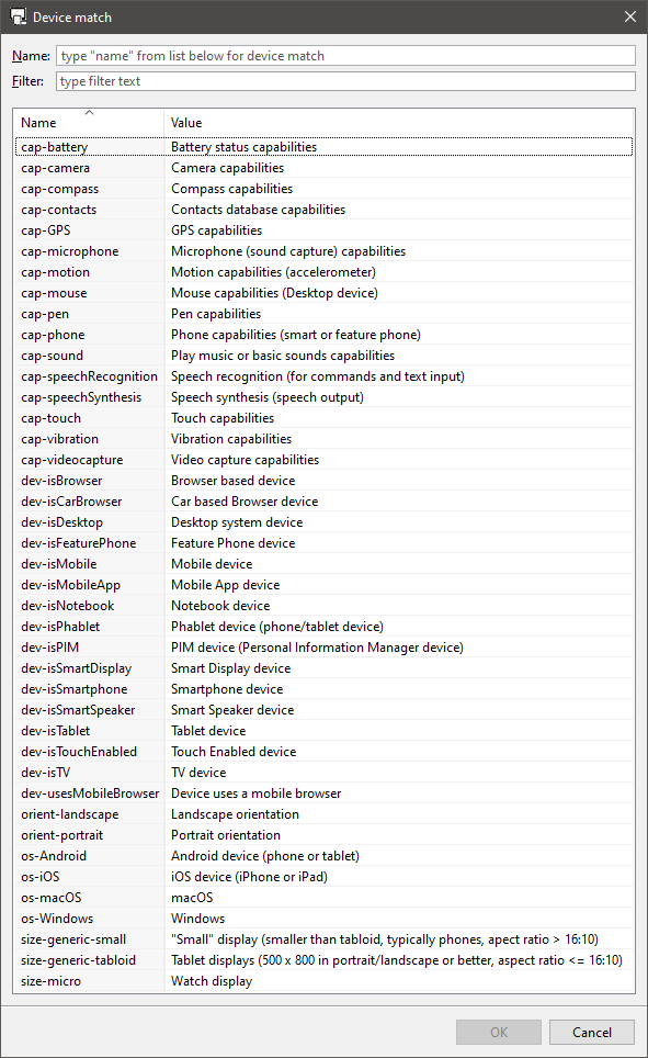
Example expression:
{ Dev: "dev-isDesktop" }
7.5 - Language code
Language code
The Language code matching expression is used to select language from the end-user device. Language codes can be matched using simple languages (without country or other additions such a language variant, e.g. “en” for any English language).
The language code selector expression is typically used when you require a certain UI for a region, e.g. you could create a selector that matches the languages available in the European Union because your application has legal information to display, and another for the Unites States.
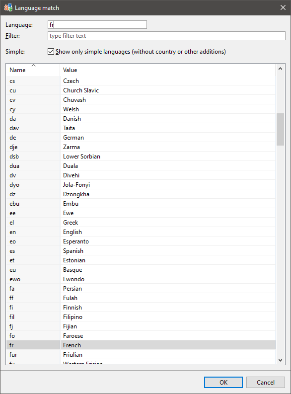
All languages will be shown when unselecting the Simple checkbox.
Example expression:
{ Lang: "fr" }
7.6 - Wildcard and Regular Expression
Wildcard and Regular Expression
To match any of the available end-user device environment variables, use the Wildcard or Regular Expression
You may enter any environment variable that the devices may have, but the prompted list in the dialog box will show the last connected device’s environment, or the Eclipse internal browser’s.
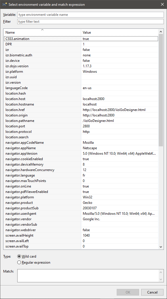
In case there is no such device available, the dialog box will show the information on how to connect a device:
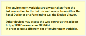
Example expression:
{ Dev: "cap-touch" }
7.7 - Customization of selectors in Java
Customization of selectors in Java
When IIZI doesn’t provide a predefined function that is suitable, you can write Java code to return a boolean.
To do so, create a class implementing the interface com.iizix.api.ISelectorExpression. If you click on the editor link create a new Java class, a wizard will help you to create the class.
Example expression:
{ Java: "myapp.MySelector" }
Sample of such a Java Expression:
import com.iizix.prop.EnvProps;
import com.iizix.prop.ISelectorExpression;
import com.iizix.server.gyro.AppSessionGyro;
import com.iizix.server.gyro.ClientSessionGyro;

public class MySelector implements ISelectorExpression {

  @Override
  public boolean isSelected (EnvProps envProps) {
    AppSessionGyro appGyro = AppSessionGyro.getSessionInstance();
    ClientSessionGyro clientGyro = ClientSessionGyro.getSessionInstance();
    return false;
  }
}
From the envProps, you can reach mostly everything. These environment properties come from the end-user device. You can also grab an instance of the AppSessionGyro or ClientSessionGyro as shown above to access e.g. client or application states for more advanced expressions
7.8 - How to add selectors?
How to add selectors?
How to add selectors? (panel)
You need a QuickStart project:
- Select
File > New > IIZI Module Project (Quickstart) - Enter
project nameand unselectCreate text tables with automatic translation - Press
Finish
- Select
Right-click on
Selectors- Select
New > Selector… - Enter a
name - Then click on
Finish
- Select
There is a list of all operations you can do
Click on
Dev- Select
os-Desktop - Then click
OK - Do
SaveorCTRL + S
- Select
Go back to your
panel- Click on
Selectorin panel’s properties - Select
Selector reference… - Choose your
Selector to addthen clickOK - Then do
File > Save AllorCTRL + SHIFT + S - This
Selectoris added to thispanel only
- Click on
How to add selectors? (package)
You need a QuickStart project:
- Select
File > New > IIZI Module Project (Quickstart) - Enter
project nameand unselectCreate text tables with automatic translation - Press
Finish
- Select
Right-click on
Selectors- Select
New > Selector… - Enter a
name - Then click on
Finish
- Select
There is a list of all operations you can do
Click on
Dev- Select
os-Desktop - Then click
OK - Do
SaveorCTRL + S
- Select
Go back to your
panel- Select
Properties - Click on
Selector - Select
Selector reference… - Choose your
Selector to addthen clickOK - Click on
Apply and Close - Then do
File > Save AllorCTRL + SHIFT + S - This
Selectoris added toall panels in this package
- Select
8 - Editors, tabs and tools
Editors, tabs and tools
TO DO
8.1 - IIZI IDE
IIZI IDE
Developers who are familiar with Eclipse will find that much of the same workspace functionality exists in the IIZI Workbench. Any options that are not user-facing, can be accessed by right-clicking and double clicking menu items. As with all Eclipse-based development environments, the iiziGo IDE presents a collection of Views and Editors. The editors that are visible in Eclipse at any given time are context sensitive, and depend on which Tab is selected or which item in a tree view is selected.
The IIZI Explorer
The Eclipse Project Explorer is replaced by the IIZI Explorer and contains four views: your iiziModule Project Explorer, the Outline View, the IIZI Server Configuration View and a Data Source Explorer.

The iiziGo Explorer Tabs
The main workspace
The main workspace is determined by whichever Editor Tab is selected at top. Tabs can represent Panels editor, Text tables editor, the Virtualspace editor, the Image Definitions editor and, of course, the Eclipse Java code editor.

Open Editor Tabs
All menu bars and toolbars are context sensitive to the selected Tab. When you start the IIZI Workspace, a Panel Editor is already open for each main Panel, along with a Text table Editor open for a Text table, and a Virtualspace Editor open for a virtualspace; all these are created when starting with iiziGo Quickstart.
The bottom section of the main workspace holds the Problems View, the IIZI Console, and a Session View which are configurable and familiar Eclipse debug views.

Problems, and IIZI Console Views
8.2 - The Panel Editor
The Panel Editor
The main Panel Editor and all corresponding panel views are visible when a Panel is selected in your project’s tree view in the IIZI Explorer. By double-clicking any Panel in your project’s Explorer tree view, a Tabbed Panel Editor is added to your workbench; you can, in this way, have several Panels opened at a time.
The Panel tree view is above the Property Editor and to the right of these is the Design area where you can see a graphical representation of your Panel in Microsoft Internet Explorer. These three windows make up your Panel design-oriented workspace. You can also view your design externally in Chrome Canary or IE.
There is demonstration video here:
Panel Editor Toolbar
The Panel Editor has a main toolbar holding tools for manipulating the components and the Panel being designed. The panel editor toolbar is located above the tree view and the Design Area. The Panel Editor has the basic tools needed to manipulate components after they have been created: Cut, Copy, Paste and Delete and all actions performed during design are revertible with Undo and Redo.

Panel editor tool bar and detail of Redo, Cut, Copy, Paste and delete
Components can be aligned inside their bounding box. When a component is created, it is given a default size, but the bounding box of the component can eventually be any size; the component can then be aligned, horizontally and vertically inside of its own bounding box.


Bounding Box and align tools for alignment of component within its own bounding box
Components are selected by clicking in the Panel area or in the Panel tree view. Multiple components are selected by using ctrl-click or shift-click. Other ways of selecting multiple components can be configured in the Selection tool in the toolbar. When multiple components are selected, they can be aligned relative to each other with the Component align tool.
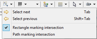

Selection tool and component alignment tools
The Design area
The Design area shows a live instance of the Panel and its components. Any changes to the component properties or hierarchy will be visible immediately. Likewise, any change in the Design area will be immediately reflected in the Panel’s properties. The Design Area Toolbar is at top far right; from the Client tool, you can choice to open the Design Viewer.

Design area tool bar showing: refresh, device choice, orientation, client, language and Zoom
8.3 - The Property Editor
The Property Editor
Check this panel
Components are defined by their Properties. The properties are laid out in a context-sensitive table called the Property Editor. All component and container properties can be set and changed in the Property Editor; since the list of properties available in the property editor can be long, all properties are structured into groups.

The toggle button for base, layout and style properties
The list of properties corresponding to each property group can be opened and closed independently of each other. Double-click one of the three buttons to isolate a properties list. Each list is organized into subgroups as a tree structure; the combined property list can be filtered with the help of the Filter text field in the Toolbar of the Property Editor.

The header of the property editor
A property consists of a name on the left and a corresponding value to the right. Hovering over the property name displays a tooltip description of the property. Experienced web developers will find many familiar HTML5 and CSS3 attributes as name-value pairs.

Properties as name-value pairs and tooltip of a property name
The property value can be defined  or
or undefined  ;
; clicking the blue arrow will erase the property values. Clicking the plus-sign icon will reveal current values and/or enable you to set values.
The value of a property can be of different data types, but in most cases the value is represented and manipulated as a string; exceptions to this are color and boolean values. The type integrity of the value is maintained by the Property Editor where improper types are marked as erroneous and the description appears in the Problems view.

Error displayed in both the property editor and problems view
Keep in mind that an undefined property may not have a value at all, as it will not exist in the mark-up that defines your component. This is akin to excluding an attribute or property when writing HTML and CSS; other properties may require values and are assigned a default value.
Further styling for normal and disabled states can be achieved through named styles created with the Style Editor, see section Styles.

Two details of the property editor showing various style properties
Note: Some of the possible values accepted by the Property Editor are not evident or listed in the property description nor listed as hints in the value field. If you are experienced in modern CSS3 markup, you can try any of the techniques you are familiar with, and you may find that the Property Editor accepts and interprets most current CSS values and formats. One example of this is the use of the viewport’s vmin attribute which is accepted as percentages, pixel values, and equations composed of the two.
8.4 - Keyboard shortcuts
Keyboard shortcuts
All Eclipse shortcuts for managing files and folders, managing Editor windows and navigating within Editors are maintained in the iiziGo framework.
It is recommended to use Ctrl + Shift + S, Save All, as you make major changes to your Panels, Text tables and virtualspace entities. This will enable iiziGo to update the many references needed to maintain live connections between your source code, Panels and virtualspace.
Common Java code editor shortcuts
All code hinting and Java code editing shortcuts are available in iiziGo.
| Shortcut | Description |
|---|---|
Ctrl + Shift + S | Save All |
Ctrl + D | Delete Line |
Ctrl + L | Go to Line |
Ctrl + Shift + T | Open Type |
Ctrl + Shift + R | Open Resource |
Navigation
Up and Down arrow keys to navigate any tree view or list;
Forward arrow key for expanding tree items;
Ctrl or Shift + Click for multiple selection.
Ctrl + 3 to hide-show text filter and search fields.
Double-click the main Tab Bar at top of Panel Editor to expand or collapse it in the workspace.
Common Design keyboard shortcuts
With a component selected you may do any of the following:
Alt + Ctrl + Left arrow to cycle through fill, center, alignment, etc.
With a property selected you may do any of the following:
Up and Down arrow keys to toggle between attributes
Up and Down arrow keys to increase or decrease numerical values
Keyboard shortcuts unique to iiziGo
Some of the keyboard shortcuts unique to the iiziGo plugin are written for you in the menu dropdown for each tool.
9 - Text content and Language
Text content and Language
TODO
9.1 - Externalizing Text
Externalizing Text
The iiziGo IDE employs novel and versatile ways for working with and organizing the text content of your iiziApp. All the text content of your project can be stored in a Text table, and this is automated for you in iiziGo through the process of externalizing texts. With all text content saved in your Text tables, text can contain HTML markup, be reused throughout the app and can benefit from iiziGo language translation features.
Externalizing Text
While you cannot type directly into any of the text components in the Design Editor, your text content workflow can be made rapid and flexible by typing or pasting text directly into the value field of any text property in the Property Editor.
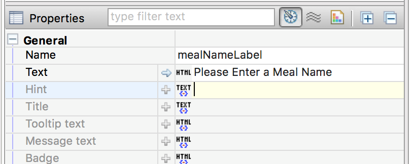
Just as easily, a Text Editor can be opened by clicking the TEXT or HTML button at the start of the value field. Text content that you enter in either the value field or in the Text Editor can then be automatically stored in a Text table by simply right-clicking the Panel and choosing: Externalize texts. You will be prompted to assign an existing Text table to the Panel if one is not already assigned. On completion of externalizing texts, the text content of all components in the Panel will be moved to your Text table and given a text ID. Text in the value field will be replaced by an iiziTag representing a link to the correct ID and content in you Text table.
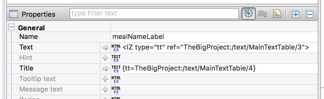
This process can be applied to individual components as well, by right clicking on the component and choosing Externalize texts. In all cases, the Panel in question must be assigned a default text table in its text table property in the Default text table section, in the Panel’s Base properties.
9.2 - The Text Editor and the KString Type
The Text Editor and the KString Type
The string type used directly for text can allow the use of HTML tags, or iiziTags for a text ID, and any combination of these. The Property Editor indicates this option by displaying a TEXT and an HTML icon in the value field. Clicking either of these icons will open the Text Editor with support for iiziTags, text IDs, HTML tags and links.

The title and tooltip text properties in the property editor
This combination of text, HTML, links, virtualspace references and text references are stored in iiziGo’s KString type which is an extension of Java’s String type. The KString allows a specified list of HTML tags and offers security in making other HTML tags illegal; JavaScript is also prohibited in KStrings. Complete information and functionality can be found in the KString API.
HTML:
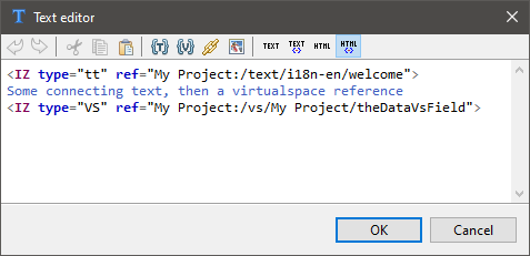
TEXT:
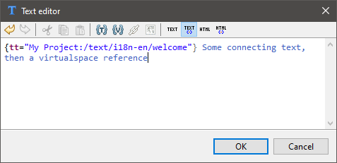
The Text Editor and text editor toolbar
9.3 - Text components
Text components
Both the Text Field and Text Area are primarily input fields. Use the Text Output component and Label component to display dynamic text, or use the Text Area component for scrollable input or output text.
Text Field can be text input and handles text length and case.

Properties:
Character update: Boolean,
Length: Number,
Hint: String,
Message: String;
Character case: Choice
Automatic tab: Boolean
Text Area can be text input and will add rows if the text so requires.

Label is a dynamic text output component.

Output is a dynamic text output that requires a virtualspace connection.

9.4 - Connecting text to components
Connecting text to components
There are several ways to connect dynamic text to the components in your user interface. A diverse and powerful combination of links, formatting and data injection is possible. With text content that already exists in your Text table, you can build and format text using the tools in the Text Editor toolbar.

The text table and virtualspace connection tools in the text editor toolbar
In the Text Editor toolbar, the Link to Text table tool, {T} will allow you to connect your current text to a new text ID, or insert text already stored in the Text table. In this way, you can build combinations of raw text and HTML formatting.
In the Text Editor toolbar, the Link to the Virtualspace entity tool, {V} will allow you to connect your current text to a new or existing vsField. Virtualspace references are not stored in the text table, but enable injection of a data directly into a text.
The Link tool allows you to insert a hyperlink to a vsAction or vsFocus, enabling navigation links or to link to any functionality within your application.

The hyperlink connection prompt from the link tool in the text editor toolbar
Images and font icons are also supported in the text content of a component. Wherever HTML tags are allowed, you can use the Image tool in the Text Editor tool bar to insert an image reference from any of your application’s image definitions.
9.5 - Working with Text tables
Working with Text tables
The Text table organizes your text content into accessible, reusable text entries that are assigned a text-ID. The texts are Strings that allow HTML tags and special iiziTags. Development in iiziGo utilizes four custom iiziTags for working with text content. Your text entries, referenced by an ID, are either plain texts, plain texts with iiziTags, HTML texts, or HTML texts with iiziTags. The iiziTags can be references to other text-IDs, or to a virtualspace, or to an Image Definition or to a hyperlink; most UI components use HTML texts.
Your application’s data providers can update text in the Text table which in turn update the UI through their respective virtualspace. When you create a project with Quickstart a Text table is created for you in the Text tables folder.

A text table with text IDs, iiziTags, HTML and text
9.6 - Multi-Language Text table example
Multi-Language Text table example
NEED text checkup HERE
The following description will show you how to create a base table (mother-tongue) for English, and how to configure your text for automatic translation to French, German and Swedish. The first page of the wizard has been filled-in specifying the name english for the Text table.
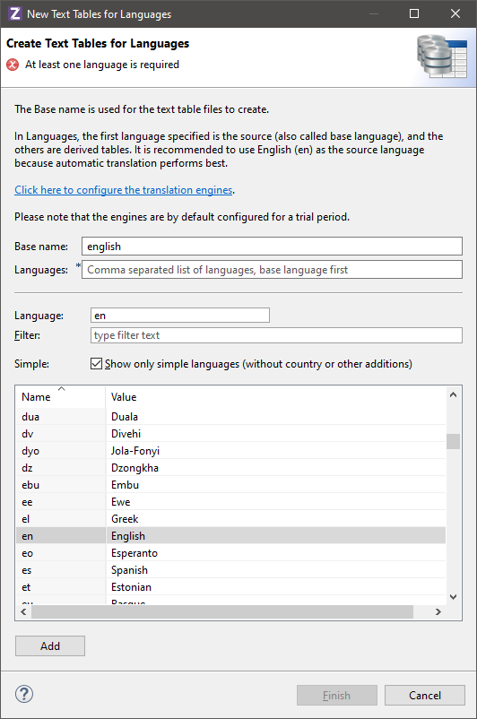

A new Text table wizard with language choices
Now you can create three additional Text tables and name them french, german and swedish respectively. Once all are created, open the Text table editor for the english table and click on the view icon.

The view icon and view menu
By selecting Open another text file in parallel, and selecting your french, german and swedish Text tables, all Text tables will be displayed in the same editor. This allows all text entries to be edited from a single point, with visual cues concerning the automatic translation.

Multilanguage Text table and HTML
The Text table editor works in two modes. The recommended way shown above offers clear visibility the text entry. Alternatively, the editor can be toggled to in-place editing to work directly in the table cells. When in-place editing is active, you can also double-click on a tag in the entry field to bring up the dialog for prompting. The in-place editing mode removes the top part of the editor to make room for additional text entries.
In the example above for the text-ID “1”, the HTML text will also be placed into language translation while keeping HTML tags in correct locations. This is achieved with Bing and Google translation; other translation engines may not handle it. The top part of the Text table editor has a larger entry field for text input. It parses the entry text depending on its type, and shows problems for invalid tags. Use the tooltip to display any error description.

Text and tags parsed in real-time with warnings
The above example offers an overview of what can be accomplished with Text tables and quick language translation for a world-ready app. The challenges presented by a multi-language user-interface are not limited to language translation but include complications in layout, font choices and cultural conventions. The use of separate dedicated Panels with unique Selectors for special language needs is recommended in iiziGo to accommodate Non-Latin Script Languages and right to left text. The iiziGo platform offers several out-of-the-box features to facilitate the work flow for building your international software.
9.7 - How to add text table on panel?
How to add text table on panel?
There is a tutorial video just down below.
You need a QuickStart project:
- Select
File > New > IIZI Module Project (Quickstart) - Enter
project nameand unselectCreate text tables with automatic translation - Press
Finish
- Select
Go to your
Panel’s properties- Click on
Text table - Select
default Text table… - Select
oneon the list - Then click
OK
- Click on
Right click on
Components- Select
Add componentthen click onLabel - Just
type something in the text - Right click on
Text’s propeties [HTML/TEXT] - Select
Externalize text - It transformed your
textinto a reference where it was exported - You can click on
it to see where it is on your text table
- Select
10 - Images and Images Definition
Images and Images Definition
NEED TO BE DONE
10.1 - Importing Images
Importing Images
All image types that are accepted by modern browsers are accepted in iiziGo. Use the Image Component to add images and graphics to your app or its content. All static images and graphics used in your iiziApp must have an Image Definition. For how to dynamically load images and graphics refer to Dynamically loading Images at Runtime.
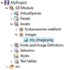
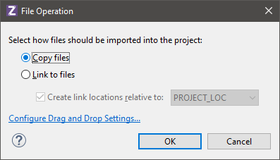
All images and graphics for you iiziApp should be kept in your Assets folder. Copy and paste files and folders into the Assets folder or right click and import your image as you would any other asset into Eclipse. Before an image can be used in the application, the image file must be present in the Assets folder.
Svg image file support
The Image component supports svg files. Image Definitions for SVG files are distinct from other Image Definitions. If the svg image displays differently than expected or will not display at all, you will have to open the file in an appropriate image editor and explore the svg mark-up. Search for the <svg> tag at beginning of file and delete everything before the tag.
10.2 - Image Definitions
Image Definitions
NEED TO BE UPDATED
All images and graphics used in your iiziApp must have an Image Definition. Your Image Definitions are kept in the Image Definitions folder. To create a new Image Definition, right-click your folder and choose either new definition for an Image (the same wizard is used for jpg, png, or gif) or new definition for an SVG. We made videos to help you on how to set it up here.
Simple image definitions
After importing a graphic or image asset into your Assets folder, Right-Click your Image Definitions folder and choose New Image Definition. It is recommended that you give a name to the image definition that includes the asset name and ends in the word definition or ImageDefinition. In the Image Definition Wizard, you give your definition a name, choose to make an image-set or a single image file definition, and then link your asset to its definition. You can then reference your image or graphic asset by its definition anywhere in your application.

New Image Definition Wizard
Complex image definitions
Open the Image Definition Editor by double-clicking an Image Definition or creating a new definition. As with all IIZI editors, the Image Definition Editor is divided into a tree view, and a property Editor. At the top is the Image Definition Editor toolbar.
The image definition is built by adding new styles and image resolutions. It can then be referred to from an Image component by the Definition name. The displayed image on the end-user will depend on the component state as well as the device resolution.
Select the image file and specify the grid values. “Marching ants” will show the identified images. A warning or error message will be shown in the dialog if values are or seem incorrect.
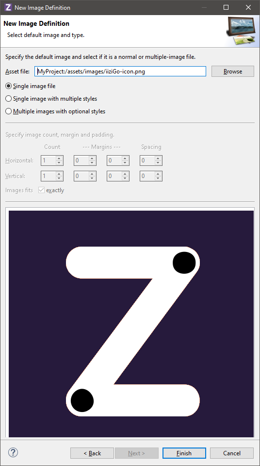
Once completed, the image definition can be used to represent an image with states that are taken from the UI component in question. The image above consists of an image of a Radio button and Checkbox. In this case, two Image Definitions for the same file should be created, with locations only defined for the respective image; you will have to delete the inappropriate image locations.
[Actually not working, need to be updated.]
These images consist of 32 icons in 4 different files with the states enabled/disabled and LTR/RTL:
You can see that the RTL icons are mirrored (but not all of them).
An image definition of the type Multiple images with optional styles is then used to identify the location of the images as well as to set their names. The states are defined by adding a New image style that will contain the image file reference and style information, in this case a combination of RTL and Disabled.

Image definition states with optional styles

Detail of properties in the Image Definition Editor
10.3 - Image Definitions Videos
Image Definitions Videos
Some examples:
How to add SVG & bitmap images (automatic)
You need a QuickStart project:
- Select
File > New > IIZI Module Project (Quickstart) - Enter
project nameand unselectCreate text tables with automatic translation - Press
Finish
- Select
Use Windows Explorer to drag/drop your images into the
Assetsfolder- Select
Copy files, thenOK - Press
Yesto generate images definitions
- Select
Your images definitions are located under
Fonts and Images Definitions/ current date time package
Go to your panel
- Right-click on
Componentsfor context menu - Add
component > Image - Click on
Image > Select Image Definition… - Select
your image, thenOK
- Right-click on
Place
your imagewherever you want
In the example we showed you PNG / SVG formats.
How to add SVG & bitmap images (manually)
You need a QuickStart project:
- Click on
File > New > IIZI Module Project (Quickstart) - Enter
project nameand unselectCreate text tables with automatic translation - Press
Finish
- Click on
Use Windows Explorer to drag/drop your images into the
Assetsfolder- Select
Copy files, thenOK - Press
Noin order not to generate automatic image definitions
- Select
Right-click on
Fonts and Images Definitions- Select
New > Image Definition or SVG Definition - Enter
a name, then clickNext - Click on
Browseand selectimage, thenFinish
- Select
Go to your panel
- Right-click on
Componentsfor context menu - Add
component > Image - Click on
Image > Select Image Definition… - Select
your image, thenOK
- Right-click on
Place
your imagewherever you want
In the example we showed you PNG / SVG formats.
10.4 - Dynamically loading Images at Runtime
Dynamically loading Images at Runtime
To load images into your application at runtime, start with a placeholder in an Image component. Dynamically loaded images do not require an Image Definition in the Image Definitions Folder, but instead require that you instantiate a RuntimeImageDefinition in your Java code. You can use the UICreateEvent to access your Panel and its Image component, and use the Image component’s setImage method to assign the image that you are accessing by URL or API.
For details on accessing Panels and UI Components in Java code see the UI Annotations section.
Image REQUESTED

Sample Java code for setting an Image Definition dynamically and loading an image at runtime
10.5 - Assets
Assets
The Assets folder contains all files used in the application that are required. They are typically images of various types, videos, audio files, static HTML files, JavaScript files, etc. Anytime an external file is needed and the file should be included in the iiziApp for distribution to a server, they should be placed in this Media files folder.
Adding files
- In Eclipse, you add
filesto a folder usingdrag-drop, e.g. from a folder onyour machineor afile server. You can also use theEclipse Import wizard.
Once files populate the asset files folder, they can be used in the application for e.g. Image definitions.
Tooltips
- IIZI adds support for tooltips everywhere in Eclipse, so if you
let the mouse hover over an image filein the media folder, the following could be displayed:
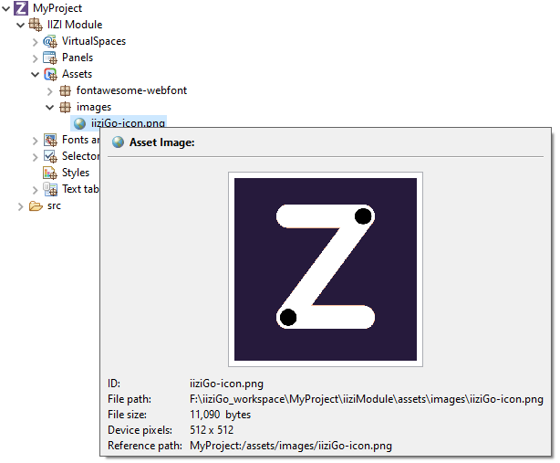
The icon used for each file depends on the file type as well as what external programs are installed in the machine, e.g. to handle editing of images (here Adobe Photoshop is used).
References
- As you may notice, there is a
Reference(orReference path) to the image that is unique in the workspace. For more information about references see the chapter References. Other details about the selected element are also shown in the tooltip depending on the element type.
10.6 - Properties
Properties
The properties of the selected component are shown – and are editable – in the Property Editor. If the Property Editor is not visible, select a Panel, a container, or any component, and the Property Editor will appear below the Panel’s tree view. For a complete guide to using the Property Editor see section Editors, Tools and Tabs.
The properties that appear in the Property Editor are context sensitive and depend entirely on the selected component or selected container. A property consists of a name on the left and a corresponding value to the right. Hovering over the property name displays a tooltip description of the property. Experienced web developers will find many familiar HTML5 and CSS3 attributes as name-value pairs.
Container and component properties
Always keep in mind that the properties displayed for you in the Property Editor correspond to the container or component that is selected. With nothing selected – or with focus outside of the Panel Editor – your Property Editor will be empty. With several components selected, the editor will exclude unshared properties.
An undefined property may not have a value at all, and will not exist in the mark-up that defines your component. This is like excluding an attribute or property when writing HTML and CSS; it simply will not exist in the mark-up. Some properties are required and therefore require values, and are assigned a default value. To see the default values, mouse over the property for the tooltip or click the arrow at the start of the value field to reveal its default value in the value field.
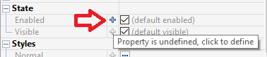
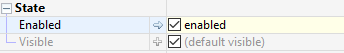
The name, actions, events and states of a component will always be found in the Base properties. The width, height and position will be in the Layout properties and most all the remaining properties we associate with CSS will be found in the Styles properties.
General properties
Although property sets are different depending on the component selected, the following properties exist for all components: Name, Title, Tooltip text, and the boolean states: Enabled and Visible.

10.7 - How to add images?
How to add images svg & bitmap?
How to add images SVG & bitmap? (auto)
There is a tutorial video just down below.
You need a QuickStart project:
- Select
File > New > IIZI Module Project (Quickstart) - Enter
project nameand unselectCreate text tables with automatic translation - Press
Finish
- Select
You can use
Windows ExplorerDrag/drop
your images into the Assets folder- Select
Copy files, thenOK - Press
Yesand it will generate for you all images definitions - All your images definitions are located under:
Fonts and Images Definitions/current date time package

- Select
Go to
your panel- Right click on
Componentsto display context menu - Add
component > Image - Click on
Image > Select Image Definition... - Select
your imagethenOK
- Right click on
Now you can place your image wherever you want
In the example we showed you PNG / SVG formats.
How to add images SVG & bitmap? (manual)
There is a tutorial video just down below.
You need a QuickStart project:
- Select
File > New > IIZI Module Project (Quickstart) - Enter
project nameand unselectCreate text tables with automatic translation - Press
Finish
- Select
You can use
Windows ExplorerDrag/drop
your images into the Assets folder- Select
Copy filesthenOK - Press
No - Right click
on Fonts and Images Definitions- Select
New > Image DefinitionorSVG Definition - Put
a namethen clickNext - Click
on Browse - Select
the imagethenFinish
- Select
- Select
Go to
your panel- Right click on
Componentsto display context menu - Add
component > Image - Click on
Image > Select Image Definition... - Select
your imagethenOK
- Right click on
Now you can place your image wherever you want
In the example we showed you PNG / SVG formats.
11 - Panels and Components
Panels and Components
NEED TO BE DONE
11.1 - Layout
Layout
You apply a Layout Manager to a Panel or other container to control the position of its child components. The available layouts are Absolute, Border, Flex and Grid. When creating a Panel or container you are given the choice of Layout Manager in the New Panel wizard or New Container wizard. You can also select the container and click the Layout tool in the Panel Editor toolbar. Some containers have an explicit Layout Manager already assigned and in these cases the Layout tool is disabled.

Layout options tool in the panel editor toolbar
Absolute layout
Absolute Layout will position and size children according to absolute values relative to the container. Minimal and maximum sizes and component alignment can be defined. Position and size properties are available under Layout properties for both the container and for individual components in the Property Editor. Click to view or double click the Layout button in the Property Editor tool bar to isolate the Layout properties. Components in the Absolute Layout have the following Layout properties:

Absolute layout properties in property editor
To achieve a responsive design with Absolute Layout, percentages can be used in Left, Top, Width, and Height values. The Property Editor also accepts percentages in combination with pixel values. For example, a component can be given a Top value of 50% minus one half of its width, to keep it in the vertical center of its parent container regardless of the containers size and shape.
Border layout
The Border layout will always stretch to fill its parent container; the Border layout will position components in the five defined regions of Top, Bottom, Center, Right and Left (Leading and Trailing are also defined for RTL language design). Visual hints are provided when dropping a component into a container with Border layout. Multiple components can be placed in the same region.

Layout regions appearing in a container with border layout
Click or double click the Layout button in the Property Editor tool bar. Components in the Border Layout have the following layout properties:

Border layout properties in property editor
The regions can be resizable at runtime by setting the Resizable property. The following values are only meaningful when the Resizable option is used: Define the limits for how small and how big with Minimum size and Maximum size as well as the initial size Width and Height.
The properties defining how the container should behave are the following:
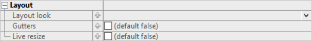
The top and bottom regions extend the entire width of the container and the remaining regions are placed in the middle. With the left and right (or leading and trailing) regions, the side regions take priority, extending the full height of the container. If the Gutters property is defined, the regions will have spacing between. The Live resize property will allow the regions to be resized at runtime.
Grid layout
The Grid Layout arranges components in rows and columns. The properties defining the Grid Layout are the following:

Grid layout properties in property editor
The number of columns is defined and the number of rows is then calculated as depending on the number of components added. The Same width and Same height properties specify whether the columns and / or rows should be distributed evenly in the Grid. The Cell spacing and Cell padding can be defined and will then be applied for all cells in the Grid.
The potential overflow of the Grid container’s content is determined by the Horizontal and Vertical align properties.

Detail of Grid layout properties that control content and grid overflow
When dragging a component over a Grid layout container, the container displays visual hints for positioning the component. Depending on the settings mentioned above, the Grid will adapt to the new components, potentially adding rows and columns.

Grid cell regions that appear in a container with Grid layout
Another way to design the structure of the Grid is to use the Grid layout actions tool in the toolbar. If the container is not empty, the way in which the newly introduced components should relate to earlier components can be specified in the Distribute dropped components menu in the toolbar.

Component distribution options tool in the panel editor toolbar
Grid Demo
There is a short demo of what you can do with Grid Layout:
You need a QuickStart project:
- Select
File > New > IIZI Module Project (Quickstart) - Enter
project nameand unselectCreate text tables with automatic translation - Press
Finish
- Select
Create a
Grid Layout panelor Add agrid layout containerto your panel.You can add
some componentsin this container.
For the example we show you all actions you can do:
Grid layoutactions:Clear- Insert
rowbefore and after - Insert
columnbefore and after - Delete
row and column - Extend
overwrite horizontally and vertically - Extend
insert horizontal and vertically
Distributedropped controls:Horizontal and vertical insertHorizontal and vertical overwriteHorizontal overwrite wrapping
Generalproperties for grid:Column countHorizontal and vertical cell spacing
Componentsproperties:Horizontal and vertical spanHorizontal and vertical align content
Flex layout
To Do
11.2 - Panels
Panels
The view of your iiziApp consists of UI Components that present data to the user and provide means to interact with the application. Before any components can be created and designed, a main container needs to be created to hold them. In iiziGo, this component is called a Panel. All UI design is done in the Panel Editor which is visible when a Panel Tab is selected. The Panel Editor is comprised of a Property Editor, a Design view and a tree view; this tree view provides the overview of the selected Panel. The tree view contains the hierarchy of the components in the Panel, as well as layout and style where applicable.
Creating and editing the view of your application as Panels enables a rich and versatile way to design and visualize an HTML and CSS user interface. Your work with Panels updates immediately in the Design view, in a browser or on any connected device without the need to refresh a page or rebuild your application. The Design area shows a live instance of the Panel and its components. This means that any change in component properties and hierarchy will be visible immediately. Likewise, any change in the Design area will be immediately reflected in the Panel’s properties.
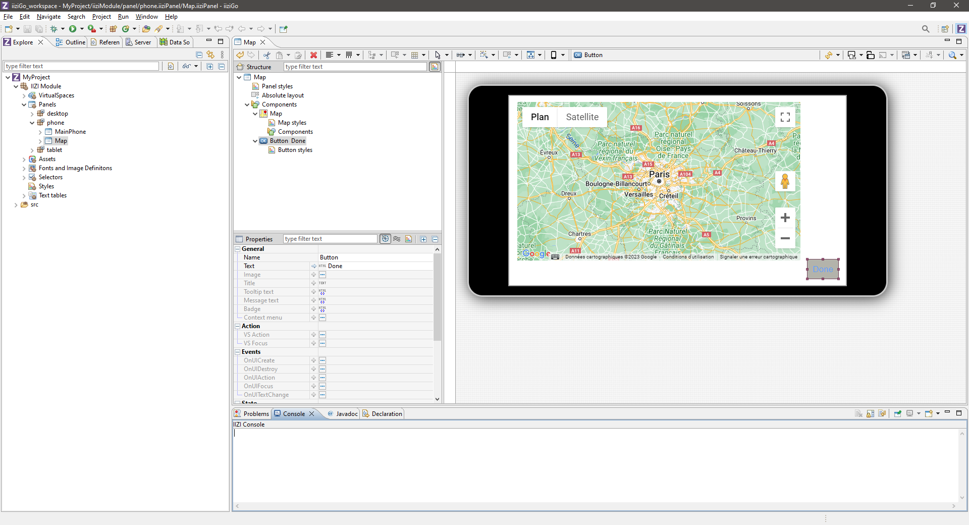
11.3 - Properties
Properties
The properties of the selected component are shown – and are editable – in the Property Editor. If the Property Editor is not visible, select a Panel, a container, or any component, and the Property Editor will appear below the Panel’s tree view. For a complete guide to using the Property Editor see section Editors, Tools and Tabs.
The properties that appear in the Property Editor are context sensitive and depend entirely on the selected component or selected container. A property consists of a name on the left and a corresponding value to the right. Hovering over the property name displays a tooltip description of the property. Experienced web developers will find many familiar HTML5 and CSS3 attributes as name-value pairs.
Container and component properties
Always keep in mind that the properties displayed for you in the Property Editor correspond to the container or component that is selected. With nothing selected – or with focus outside of the Panel Editor – your Property Editor will be empty. With several components selected, the editor will exclude unshared properties.
An undefined property may not have a value at all, and will not exist in the mark-up that defines your component. This is like excluding an attribute or property when writing HTML and CSS; it simply will not exist in the mark-up. Some properties are required and therefore require values, and are assigned a default value. To see the default values, mouse over the property for the tooltip or click the arrow at the start of the value field to reveal its default value in the value field.


The name, actions, events and states of a component will always be found in the Base properties. The width, height and position will be in the Layout properties and most all the remaining properties we associate with CSS will be found in the Styles properties.
General properties
Although property sets are different depending on the component selected, the following properties exist for all components: Name, Title, Tooltip text, and the boolean states: Enabled and Visible.
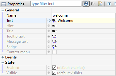
11.4 - Components
Components
Most of the components are implemented using the Dojo framework. Many of the components are cross-platform meaning that they will exist for all types of devices, but they will look and behave differently depending on the device. Other components will only exist in a desktop or mobile version. Some components require special containers; Table column components belong in a Table container, for example, and cannot be placed anywhere else. Map markers belong in a Map marker container, List item components must be placed in a List Group container, and so forth.
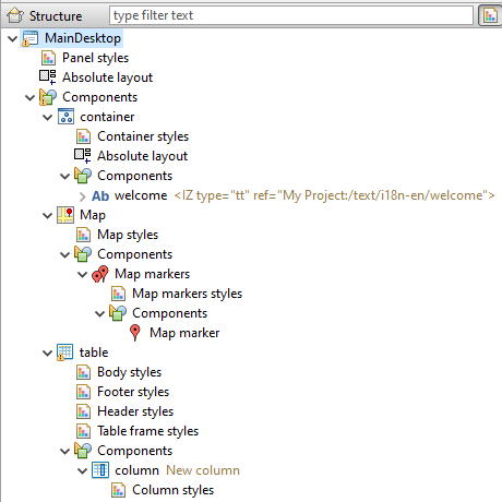
The JavaScript source code of your components is not available to the developer. However, the skinning, sizing, positioning – and much more – are exposed as component properties in the Property Editor. Further manipulation of components can be achieved through your Java code. A component’s available properties are also determined by the Layout Manager of its parent container.
11.5 - Components List
Components List
NEED TO WORK ON THAT ONE
The following is a comprehensive list of components available in the current version of iiziGo. Where indicated, a component is classified specifically for mobile or for desktop. Some components require specific parent containers. All components have default properties that can be viewed and edited in the Property Editor.
| Icon | Name | Description |
|---|---|---|
 | Button | With default border color change on mouse down |
 | Checkbox | |
 | Radio button | |
 | Tab Bar | |
 | Progress bar | |
 | Slider | |
 | Image component | |
 | Combobox | |
 | Spinner | |
 | Progress indicator | Indicates user interface is busy |
 | Switch Mobile only | Common to phone and tablet interface |
 | Text Field | Single line input text, output text |
 | Text Area | Scrollable multi-line, input text, output text |
 | Label | Dynamic and static output text |
 | Output text | Requires a virtualspace connection |
 | TableColumn | Requires Table container |
 | Calendar | |
 | Map | Google Map API |
 | Map Marker |
Mobile Only
| Icon | List Container > List Group Container | Description |
|---|---|---|
 | Simple List Item | |
 | Checkbox List Item | |
 | Radio Button List Item | |
 | Text Field List Item | |
 | Combobox List Item | |
 | DateTime List Item | |
 | Switch List Item |
Desktop Only
| Icon | Menu Bar Container > Menu | Description |
|---|---|---|
| Checked Item | ||
 | Menu Item | |
| Menu Separator | ||
| Radio Item |
11.6 - Containers
Containers
The generic Container and the Swap container can be assigned a Layout Manager. For other containers, contents and layout are explicit; this is the case for the List container and List Group container, Menu Bar container, Map container and Map Markers container. These containers can contain only specific types of components and will position their children in ways that are simple and specific to the container.
List of Containers (iiziGo 1.2)
- Context Menu container
- List container and List Group container
- Map container and Map Markers container
- Menu Bar container (desktop only)
- Container (generic)
- Swap container
- Table container
- Tab bar container
- Heading container
The Swap Container allows the dynamic loading of the List Container and the generic Container. The common page-slide-in from the right can be accomplished by placing a Swap Container in your Panel and adding further Containers to the components folder of the Swap Container. The order of these containers will be zero-indexed from the top container.
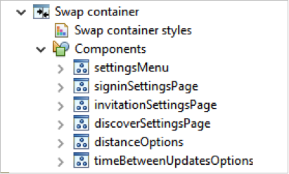
You can then see the containers inside the swap and iterate through the children of the swap by selecting the Swap Container and using the page-down and page-up keys on your keyboard.
The List and List Group Containers
The List belongs only to mobile development. When you add a List Container, a List Group container is already created within it. You can add List Item Components to the Group for a single list, or add other List Groups.
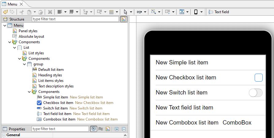
11.7 - Styles
Styles
NEED TO WORK HERE
Apart for the Property Editor which enables you to set and change all the styles available to your components and containers, iiziGo offers you a comprehensive interface for creating style sheets called the Style Editor. You can use the Style Editor to create a named CSS style. This named style can then be referenced in the Base properties of a component, under the property group, Styles where a component will have two properties, Normal and Disabled.
As of the present version of iiziGo, only the components for which the Styles property group appear in the Property Editor are eligible for named style sheets.

Styles group in the property editor for attaching a named style sheet
To create a new named style, right-click on the Styles folder in your project’s tree view and choose New style. The Style Editor will open. The Style Editor includes a live presentation of all the style properties offered in the Style section of your Panel’s Property Editor. Explore and create CSS styles by experimenting with properties; you will see that the results update immediately in the Style Editor display.

The styles editor with instant presentation of the CSS styles
(EDIT IS Required here)
12 - iiziRun Development and App Distribution
iiziRun Development and App Distribution
NEED TO BE DONE
12.1 - Set up iiziServer for live development
Set up iiziServer for live development
The two apps for mobile, iiziRun Developer and iiziRun Custom, are downloaded by both the developer and end-user for testing or consuming an iiziApp. You will use iiziRun Developer on all your mobile devices as you test and develop with iiziGo. Your finished application is deployed with a special version of iiziRun Custom that has a custom graphical appearance to represent your software’s branding and meant to be downloaded by the consumer of your application.
There is a tutorial down below, you need to do a quickstart project:
– To use the iiziServer included in iiziGo, only minimal server configuration is required. In the Eclipse Run/Debug menu, find and click the small menu drop down next to the green Run icon and choose Run Configuration.
– You can also go to Run in the main menu and choose Run Configurations… to open the server configuration editor.
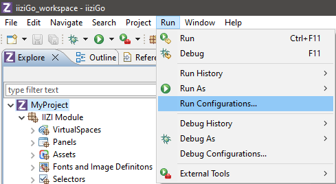
– Right-click IIZI Development Server and choose New Configuration.
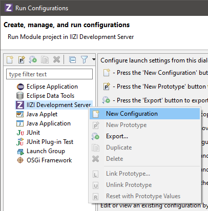
– You can also right-click your project and choose Run As > Run on IIZI Development Server which will open the Create, manage and run configurations window. You must double click IIZI Development Server in the tree view on the left, to open the iiziServer Editor.
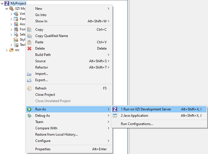

The iiziServer editor for quick configuration of a development server
For the simplest development server set up, keep the config.iiziServer path as is, choose a range of ports, and leave the environment to the default file. Only one application per server is possible. Later, if you wish, you can configure multiple environment files. Click Run to start the server.
12.2 - iiziRun Developper
iiziRun Developper
NEED iiziRun (phone) Screenshots
iiziRun Developer is free to install from App Store and Google Play. The iiziRun Developer app is used to test UI designs developed with the iiziGo IDE. It also runs IIZI universal apps from an iiziServer without having to submit your app to Google Play or the App Store more than once.


Video tutorial for downloading and installing iiziRun Developer at the iiziPlatform YouTube Channel: https://www.youtube.com/watch?v=t1Z7r6HsJIo
After installing iiziRun Developer on a mobile device, configure a server and choose your iiziApp. At this point in your set up, your iiziServer must be running in iiziGo.
On opening iiziRun Developer you are prompted to open a Panel or add an application; tap Add Application and continue directly to Server and then tap Add Server.
Having chosen Add Server, enter the server definition and port for your computer’s local IP or local network IP, and click the blue Save icon at top to save. Upon tapping Application you should find your current iiziApp available, tap it to choose it, and once added, tap the blue Save icon at top. Repeat the above process for any phone or tablet you wish to use for development and testing.
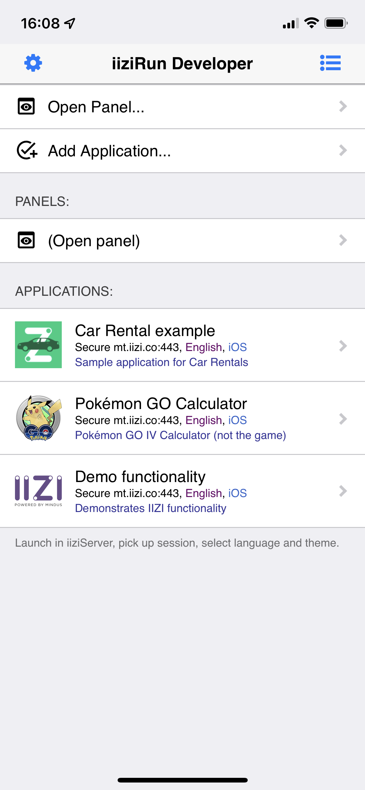
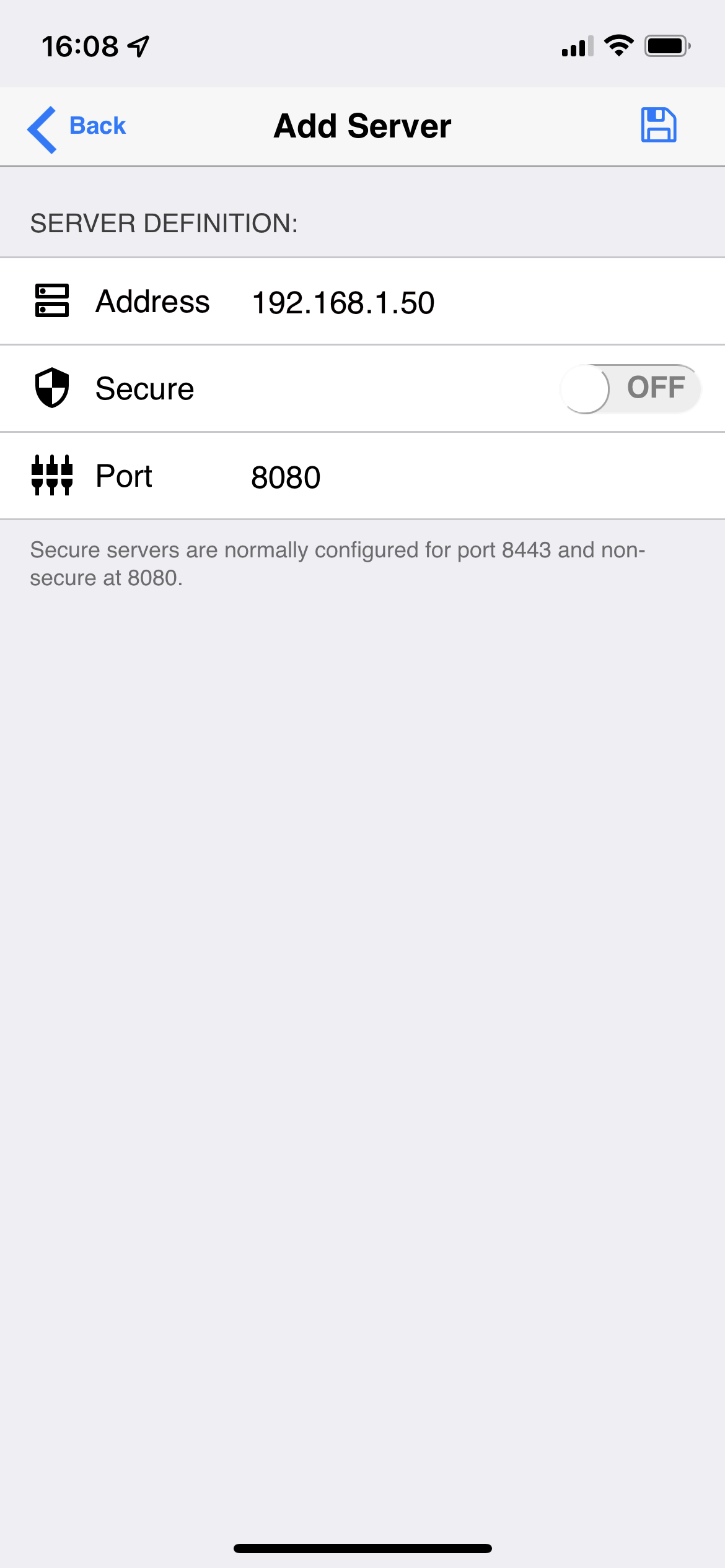
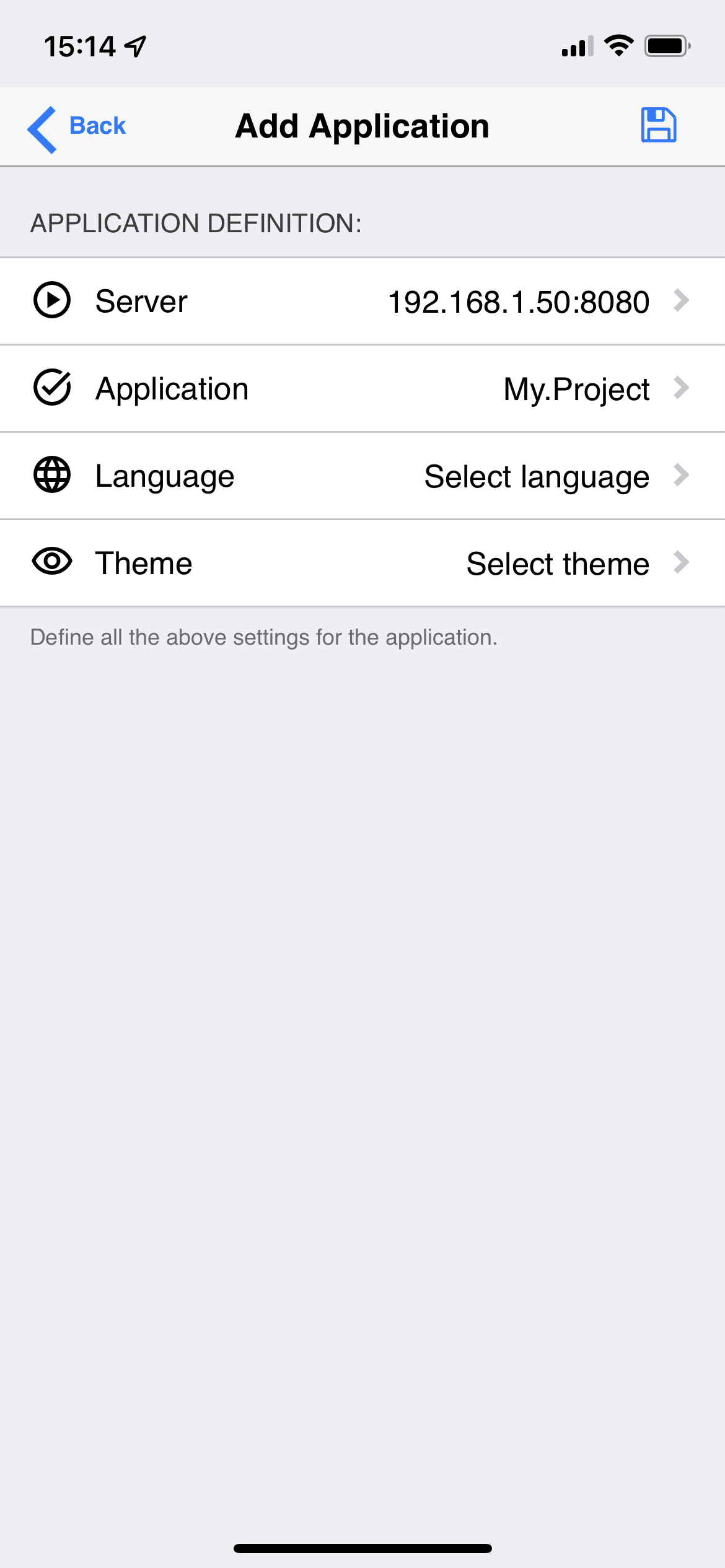
As you develop your iiziApp, you can update and view your work instantly on connected devices with iiziRun Developer. Connect as many devices as you wish for viewing and testing you Java code, Panels and components, or any other app functionality.
Panel Design and the Panel option on iiziRun Developer
In addition to runtime tests, you can choose any Panel from the iiziRun Developer Open Panel section and develop with your device connected by Wi-Fi or by cable. The Open Panel option in iiziRun Developer does not require running the IIZI Development Server. All changes made to your Panel should update immediately on all your connected phones and tablets without needing to refresh or relaunch. This view of a single Panel displays the iiziGo’s localhost design view, and like the Design Editor, does not include UI actions, links or connections to other Panels.
To connect a device to the iiziGo localhost instance, choose Open Panel in iiziRun Developer and set up an iiziGo instance by tapping: iiziGo instance > add iiziGo. Here you can add your localhost address or IP.
12.3 - iiziRun Custom
iiziRun Custom
To finally release an iiziRun Custom app that is branded for use with your new application and for submission to the App Store, Google Play, and the Microsoft Store, you will use the iiziRun Builder utility integrated into the iiziGo IDE. The resulting mobile app is given a custom graphical appearance to represent your software’s branding and meant to be downloaded by the consumer of your application.
The difficult process of submitting to the App Store, Google Play and the Microsoft Store is automated for you in the iiziRun Builder workspace where you prepare the explicit build requirements for each.
By right-clicking your project and choosing properties and expanding the IIZI option, you will find three further options App, Distribution and Runtime. Choose Runtime to display the iiziRun Builder instructions and forms necessary for the creation of your iiziRun Custom app.

The instructions and forms under Runtime for enabling iiziRun Builder
This iiziRun Custom instance carrying your application branding will be submitted only once to each mobile app distributor i.e. the App Store, Google Play, and the Microsoft Store. All further versioning and updating of your application will be made to the iiziApp that has been deployed to your production server.
12.4 - Distribution of your iiziApp
Distribution of your iiziApp
There is a tutorial video just down below.
Note: This option is not yet available for the early access.
Your IIZI project can be built and deployed to your server through the Distribution option under IIZI found in your project’s properties.
The developed iiziApp can consist of Module projects and Java projects. It can also refer to libraries and directories containing Java code, both project-based and external. In order to run the application on an IIZI Server, the iiziApp must be compiled into a Jar file. The iiziApp compiled into a Jar file is called an Application Distribution. The process of creating this Jar file is called Application Distributor.
The Application Distributor is a utility that is integrated in iiziGo but is also available as a stand-alone Java program that you can run from a batch file or a build system, e.g. Ant.
Configuration
The Application Distributor must first be configured for a Module project to be distributed. Open the Module project properties dialog and select Enable Application Distribution:
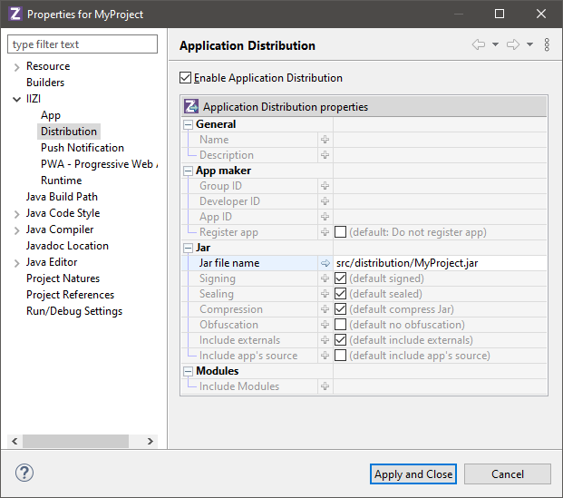
Fill in the Jar file name. If the iiziApp consists of several modules projects, specify them in a comma separated list in Include Modules. Dependent modules and Java project, libraries and directories are always added to the Jar file, with the exception of externals that provides a separate option for the operation to perform.
Dependent modules are known at build time of the distribution when all references are resolved. All the referenced modules (including their references) will therefore be included in the iiziApp. Dependent Java projects, libraries and directories are known from the Java Build Path.
Externals
The Externals are external libraries and directories that may be specified in the projects classpaths of the Java Build Path.
If you do not include externals, the Jar file will be smaller and if several module applications share the same externals, you will use less memory for the server because it will only be loaded once. However, the externals must be in the server classpath.
Note: Be careful with this option, as the same class may from a library or a directory can be loaded several times from different iiziApp’s, and each class static (instance) will not be same between two iiziApp’s (meaning that there can be multiple “static singletons”). If this could be the case, you will have to unselect the option Include externals and to set the classpath of the server to include these externals.
Exporting iiziApp
The iiziApp is created by exporting the Module project. Open the Export Wizard using File → Export:
Click on Next and select the project to create a distribution for:
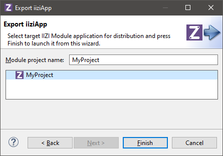
Only projects configured for application distribution are shown above.
When you press Finish, the Application Distributor will be started in a separate Eclipse job.
Note: An application containing errors and/or warnings cannot be exported!
12.5 - How to run your application?
How to run your application?
How to run your application?
There is a tutorial video just down below.
You need a QuickStart project:
- Select
File > New > IIZI Module Project (Quickstart) - Enter
project nameand unselectCreate text tables with automatic translation - Press
Finish
- Select
Right click on
your project name- Select
Run AsthenRun on IIZI Development Server - Press
Yesto add newRun Configuration - Right click on
iiziDevelopment Serveron the left - Select
New Configuration - Enter a
namefor the configuration, we recommend to use same name as your project - Here you can manage your application settings
- Click on
ApplythenRun - Server logs are
displayed on the bottom partin Console
- Select
You can add
another perspective view- Go on
top right partof iiziGo - Click on
window iconthen selectDebug - You added another perspective to switch on when you start your application
- Go on
To test it:
- You need to
open your browserand go to: http://localhost:8080 - Click on the link:
here - Then click on
Startto launch the app in the browser
- You need to
13 - Examples
Examples
NEED TO BE DONE
13.1 - Code examples
Code examples
How to add ui code?
There is a tutorial video just down below.
You need a QuickStart project:
- Select
File > New > IIZI Module Project (Quickstart) - Enter
project nameand unselectCreate text tables with automatic translation - Press
Finish
- Select
Add
Text Field- Name it:
text (on component and VSField)
- Name it:
Add
Button- On Button properties, go to
Events > OnUIAction > Create new method… - Choose
Create > Then OK - Enter the texts in the
entry fields: Package: com.iizi.ui- Name:
Code - Then click on
Finish - Method name:
onClick- Paste this code in the method
- On Button properties, go to
UIText text = event.getSource().getUIPanel().getFirstUIComponentNull(“text”, UIText.class);
text.requestFocus();
Place your
mouse cursoronUIText, underlined with red- Select
Import "UIText" (com.iizi.prop.ui) - Then do
File > Save All or CTRL + SHIFT + S - Right click on
the project name > Run As > Run on IIZI Development Server - If it says “No configured IIZI Development Server configuration is found”: Choose
Yes. - Right click on
IIZI Development Server > New Configuration > Put a Name > Run it
- Select
To test it:
- You need to
open your browserand go to: http://localhost:8080 - Click on the link:
here - Then click on
Startto launch the app in the browser - Press the
Clickbutton and it sets theUI focusto the Text Field
- You need to
How to add 10 rows?
There is a tutorial video just down below.
You need a QuickStart project:
- Select
File > New > IIZI Module Project (Quickstart) - Enter
project nameand unselectCreate text tables with automatic translation - Press
Finish
- Select
Select
tablein containers anddrag/drop itto your panel.- Name it:
myTable - Go to the
Propertiesfor the UI Table and adda VS Table to your panel VS Group - Add
a (UI) table columnandlink it in the VS Table
- Name it:
Drag and drop Buttonto the panel- Create
VS Actionfor this button - Name it:
addContent
- Create
Go to
VirtualSpaceand in properties inConnectors > Java Class > Create new class…Enter the textsin the input fields:- Package:
com.iizi.vs - Name:
VirtualSpace - Then
click on Finish
Select
addContent’s properties, Connectors > OnVSAction > Create new method…- Method name:
addContent - Paste this code in the method:
- Method name:
VSTable table = event.getTable("group/myTable");
Value[] rowValues = new Value[1];
for ( int item = 1; item <= 10; ++item ) {
rowValues[0] = new Value("Test - "+item);
table.addRow(rowValues);
}
Place your
mouse cursoron errors you will see:VSTable and do:
Import "VSTable" (com.iizix.prop.vs)Value[] and do:
Import "Value" (com.iizix)
Then do
File > Save AllorCTRL + SHIFT + S- Right click on
project name > Run As > Run on IIZI Development Server - If it says “No configured IIZI Development Server configuration is found”: Choose
Yes. - Right click on
IIZI Development Server > New Configuration > Add a Configuration Name > Run it
- Right click on
To test it:
- You need to open your browser and go to: http://localhost:8080/
- Click on the link:
here - Then click on
Startto launch the app in the browser. - You just click on the
Add contentsbutton and it will add a new row.
How to set a value in an entry field?
There is a tutorial video just down below.
You need a QuickStart project:
- Select
File > New > IIZI Module Project (Quickstart) - Enter
project nameand unselectCreate text tables with automatic translation - Press
Finish
- Select
Select
Text fieldin components anddrag/dropit to your panel.- Name it:
text - Add
it to your VS Group
- Name it:
Add
Buttonandadd this in properties:- Text:
Edit text - Click on
VS Action > Create VS Action… > Add it to your VS Group - Set the action name:
editText - Then click on
Finish
- Text:
Go to
VirtualSpaceand in properties inConnectors > Java Class > Create new class…- Type in:
- Package:
com.iizi.vs - Name:
VirtualSpace - Then click on
Finish
Select
editText’s properties, Connectors > OnVSAction > Create new method…- Method name:
editText - Replace
your methodwith this code in your class:
- Method name:
@OnVSAction(name = "group/editText")
public void editText(VSActionEvent event) throws ValueConversionException {
event.getField((@VSRef String) "group/text").set_String("My Message");
}
Place your
mouse cursoron errors you will see:- ValueConversionException and do an:
Import "ValueConversionException" (com.iizix.prop) - @VSRef and do an:
Import "VSRef" (com.iizix.api.vs)
- ValueConversionException and do an:
Then do
File > Save AllorCTRL + SHIFT + S- Right click on
project name > Run As > Run on IIZI Development Server - If it says “No configured IIZI Development Server configuration is found”: Choose
Yes. - Right click on
IIZI Development Server > New Configuration > Set a Name > Run it
- Right click on
To test it:
- You need to
open your browserand go here: http://localhost:8080/ - Click on the link:
here - Then click on
Startto launch the app in the browser. - You just click
on the buttonand it will edittext field.
- You need to