NEED TO BE DONE
This is the multi-page printable view of this section. Click here to print.
Panels and Components
Panels and Components
- 1: Layout
- 2: Panels
- 3: Properties
- 4: Components
- 5: Components List
- 6: Containers
- 7: Styles
1 - Layout
Layout
You apply a Layout Manager to a Panel or other container to control the position of its child components. The available layouts are Absolute, Border, Flex and Grid. When creating a Panel or container you are given the choice of Layout Manager in the New Panel wizard or New Container wizard. You can also select the container and click the Layout tool in the Panel Editor toolbar. Some containers have an explicit Layout Manager already assigned and in these cases the Layout tool is disabled.

Layout options tool in the panel editor toolbar
Absolute layout
Absolute Layout will position and size children according to absolute values relative to the container. Minimal and maximum sizes and component alignment can be defined. Position and size properties are available under Layout properties for both the container and for individual components in the Property Editor. Click to view or double click the Layout button in the Property Editor tool bar to isolate the Layout properties. Components in the Absolute Layout have the following Layout properties:

Absolute layout properties in property editor
To achieve a responsive design with Absolute Layout, percentages can be used in Left, Top, Width, and Height values. The Property Editor also accepts percentages in combination with pixel values. For example, a component can be given a Top value of 50% minus one half of its width, to keep it in the vertical center of its parent container regardless of the containers size and shape.
Border layout
The Border layout will always stretch to fill its parent container; the Border layout will position components in the five defined regions of Top, Bottom, Center, Right and Left (Leading and Trailing are also defined for RTL language design). Visual hints are provided when dropping a component into a container with Border layout. Multiple components can be placed in the same region.

Layout regions appearing in a container with border layout
Click or double click the Layout button in the Property Editor tool bar. Components in the Border Layout have the following layout properties:

Border layout properties in property editor
The regions can be resizable at runtime by setting the Resizable property. The following values are only meaningful when the Resizable option is used: Define the limits for how small and how big with Minimum size and Maximum size as well as the initial size Width and Height.
The properties defining how the container should behave are the following:
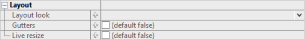
The top and bottom regions extend the entire width of the container and the remaining regions are placed in the middle. With the left and right (or leading and trailing) regions, the side regions take priority, extending the full height of the container. If the Gutters property is defined, the regions will have spacing between. The Live resize property will allow the regions to be resized at runtime.
Grid layout
The Grid Layout arranges components in rows and columns. The properties defining the Grid Layout are the following:

Grid layout properties in property editor
The number of columns is defined and the number of rows is then calculated as depending on the number of components added. The Same width and Same height properties specify whether the columns and / or rows should be distributed evenly in the Grid. The Cell spacing and Cell padding can be defined and will then be applied for all cells in the Grid.
The potential overflow of the Grid container’s content is determined by the Horizontal and Vertical align properties.

Detail of Grid layout properties that control content and grid overflow
When dragging a component over a Grid layout container, the container displays visual hints for positioning the component. Depending on the settings mentioned above, the Grid will adapt to the new components, potentially adding rows and columns.

Grid cell regions that appear in a container with Grid layout
Another way to design the structure of the Grid is to use the Grid layout actions tool in the toolbar. If the container is not empty, the way in which the newly introduced components should relate to earlier components can be specified in the Distribute dropped components menu in the toolbar.

Component distribution options tool in the panel editor toolbar
Grid Demo
There is a short demo of what you can do with Grid Layout:
You need a QuickStart project:
- Select
File > New > IIZI Module Project (Quickstart) - Enter
project nameand unselectCreate text tables with automatic translation - Press
Finish
- Select
Create a
Grid Layout panelor Add agrid layout containerto your panel.You can add
some componentsin this container.
For the example we show you all actions you can do:
Grid layoutactions:Clear- Insert
rowbefore and after - Insert
columnbefore and after - Delete
row and column - Extend
overwrite horizontally and vertically - Extend
insert horizontal and vertically
Distributedropped controls:Horizontal and vertical insertHorizontal and vertical overwriteHorizontal overwrite wrapping
Generalproperties for grid:Column countHorizontal and vertical cell spacing
Componentsproperties:Horizontal and vertical spanHorizontal and vertical align content
Flex layout
To Do
2 - Panels
Panels
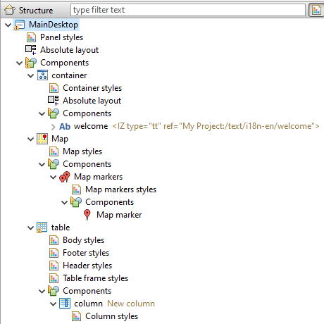
The view of your iiziApp consists of UI Components that present data to the user and provide means to interact with the application. Before any components can be created and designed, a main container needs to be created to hold them. In iiziGo, this component is called a Panel. All UI design is done in the Panel Editor which is visible when a Panel Tab is selected. The Panel Editor is comprised of a Property Editor, a Design view and a tree view; this tree view provides the overview of the selected Panel. The tree view contains the hierarchy of the components in the Panel, as well as layout and style where applicable.
Creating and editing the view of your application as Panels enables a rich and versatile way to design and visualize an HTML and CSS user interface. Your work with Panels updates immediately in the Design view, in a browser or on any connected device without the need to refresh a page or rebuild your application. The Design area shows a live instance of the Panel and its components. This means that any change in component properties and hierarchy will be visible immediately. Likewise, any change in the Design area will be immediately reflected in the Panel’s properties.
3 - Properties
Properties
The properties of the selected component are shown – and are editable – in the Property Editor. If the Property Editor is not visible, select a Panel, a container, or any component, and the Property Editor will appear below the Panel’s tree view. For a complete guide to using the Property Editor see section Editors, Tools and Tabs.
The properties that appear in the Property Editor are context sensitive and depend entirely on the selected component or selected container. A property consists of a name on the left and a corresponding value to the right. Hovering over the property name displays a tooltip description of the property. Experienced web developers will find many familiar HTML5 and CSS3 attributes as name-value pairs.
Container and component properties
Always keep in mind that the properties displayed for you in the Property Editor correspond to the container or component that is selected. With nothing selected – or with focus outside of the Panel Editor – your Property Editor will be empty. With several components selected, the editor will exclude unshared properties.
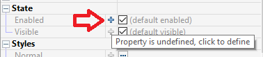
An undefined property may not have a value at all, and will not exist in the mark-up that defines your component. This is like excluding an attribute or property when writing HTML and CSS; it simply will not exist in the mark-up. Some properties are required and therefore require values, and are assigned a default value. To see the default values, mouse over the property for the tooltip or click the arrow at the start of the value field to reveal its default value in the value field.
The name, actions, events and states of a component will always be found in the Base properties. The width, height and position will be in the Layout properties and most all the remaining properties we associate with CSS will be found in the Styles properties.
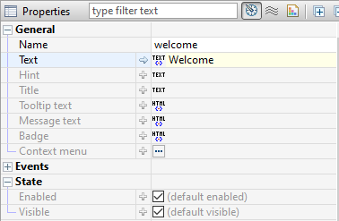
General properties
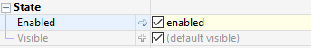
Although property sets are different depending on the component selected, the following properties exist for all components: Name, Title, Tooltip text, and the boolean states: Enabled and Visible.
4 - Components
Components
Most of the components are implemented using the Dojo framework. Many of the components are cross-platform meaning that they will exist for all types of devices, but they will look and behave differently depending on the device. Other components will only exist in a desktop or mobile version. Some components require special containers; Table column components belong in a Table container, for example, and cannot be placed anywhere else. Map markers belong in a Map marker container, List item components must be placed in a List Group container, and so forth.
The JavaScript source code of your components is not available to the developer. However, the skinning, sizing, positioning – and much more – are exposed as component properties in the Property Editor. Further manipulation of components can be achieved through your Java code. A component’s available properties are also determined by the Layout Manager of its parent container.
5 - Components List
Components List
NEED TO WORK ON THAT ONE
The following is a comprehensive list of components available in the current version of iiziGo. Where indicated, a component is classified specifically for mobile or for desktop. Some components require specific parent containers. All components have default properties that can be viewed and edited in the Property Editor.
| Icon | Name | Description |
|---|---|---|
 | Button | With default border color change on mouse down |
 | Checkbox | |
 | Radio button | |
 | Tab Bar | |
 | Progress bar | |
 | Slider | |
 | Image component | |
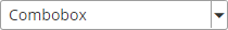 | Combobox | |
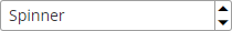 | Spinner | |
 | Progress indicator | Indicates user interface is busy |
 | Switch Mobile only | Common to phone and tablet interface |
 | Text Field | Single line input text, output text |
 | Text Area | Scrollable multi-line, input text, output text |
 | Label | Dynamic and static output text |
 | Output text | Requires a virtualspace connection |
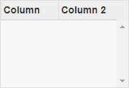 | TableColumn | Requires Table container |
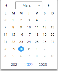 | Calendar | |
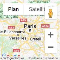 | Map | Google Map API |
 | Map Marker |
Mobile Only
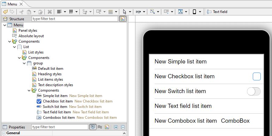
| Icon | List Container > List Group Container | Description |
|---|---|---|
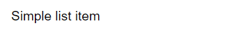 | Simple List Item | |
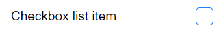 | Checkbox List Item | |
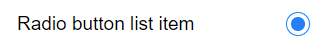 | Radio Button List Item | |
 | Text Field List Item | |
 | Combobox List Item | |
 | DateTime List Item | |
 | Switch List Item |
Desktop Only
| Icon | Menu Bar Container > Menu | Description |
|---|---|---|
| Checked Item | ||
 | Menu Item | |
| Menu Separator | ||
| Radio Item |
6 - Containers
Containers
The generic Container and the Swap container can be assigned a Layout Manager. For other containers, contents and layout are explicit; this is the case for the List container and List Group container, Menu Bar container, Map container and Map Markers container. These containers can contain only specific types of components and will position their children in ways that are simple and specific to the container.
List of Containers (iiziGo 1.2)
- Context Menu container
- List container and List Group container
- Map container and Map Markers container
- Menu Bar container (desktop only)
- Container (generic)
- Swap container
- Table container
- Tab bar container
- Heading container
The Swap Container allows the dynamic loading of the List Container and the generic Container. The common page-slide-in from the right can be accomplished by placing a Swap Container in your Panel and adding further Containers to the components folder of the Swap Container. The order of these containers will be zero-indexed from the top container.
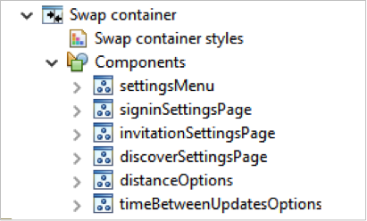
You can then see the containers inside the swap and iterate through the children of the swap by selecting the Swap Container and using the page-down and page-up keys on your keyboard.
The List and List Group Containers
The List belongs only to mobile development. When you add a List Container, a List Group container is already created within it. You can add List Item Components to the Group for a single list, or add other List Groups.
7 - Styles
Styles
NEED TO WORK HERE
Apart for the Property Editor which enables you to set and change all the styles available to your components and containers, iiziGo offers you a comprehensive interface for creating style sheets called the Style Editor. You can use the Style Editor to create a named CSS style. This named style can then be referenced in the Base properties of a component, under the property group, Styles where a component will have two properties, Normal and Disabled.
As of the present version of iiziGo, only the components for which the Styles property group appear in the Property Editor are eligible for named style sheets.

Styles group in the property editor for attaching a named style sheet
To create a new named style, right-click on the Styles folder in your project’s tree view and choose New style. The Style Editor will open. The Style Editor includes a live presentation of all the style properties offered in the Style section of your Panel’s Property Editor. Explore and create CSS styles by experimenting with properties; you will see that the results update immediately in the Style Editor display.

The styles editor with instant presentation of the CSS styles
(EDIT IS Required here)