NEED TO BE DONE
This is the multi-page printable view of this section. Click here to print.
Starting UI design and UI creation
Starting UI design and UI creation
- 1: Start with UI
- 2: Layout managers
- 3: Create components quickly
- 4: Data-oriented components
- 5: The Property editor; base, layout and styles
- 6: Improvising HTML and CSS
- 7: Choosing a device list, device orientation and zoom
- 8: A note on Responsive design
- 9: Locking orientation for Mobile
- 10: Connect to a VirtualSpace
1 - Start with UI
Start with UI
If your web application requires designing the UI first, iiziGo provides a comprehensive drag and drop UI builder with an extensive list of UI components. No JavaScript or HTML development is required.
Your user interface builder in iiziGo is the Panel Editor and is based on the Panel Container. The Panel is always a main container for a view and will be the root container for UI components; each Panel can be thought of as a page. Having created your new project with Quickstart, there are already several Panels created for you. Start with the mainPhonePanel or mainTabletPanel by double clicking it in the IIZI Explorer.
Components are selected by clicking on the component’s name in the Panel’s tree view or by clicking the component directly in the Design Editor. Multiple components are selected by using ctrl-click or shift-click. The Panel organizes its children and resizes in strict accordance with its Layout Manager. It is important to remember that a component’s available properties are also determined by the Layout Manager of its parent container.
2 - Layout managers
Layout managers
When using Quickstart, a Layout Manager is automatically assigned to the three main panels in three separate panel subfolders. When creating new Panels, you must assign a Layout Manager for your new Panel in the New Panel Wizard. There are four possible layouts:
Flex Layout (Not added here)
For more information on Layout, see Layout section.
Layout
You apply a Layout Manager to a Panel or other container to control the position of its child components. The available layouts are Absolute, Border, Grid and Flex. When creating a Panel or container you are given the choice of Layout Manager in the New Panel wizard or New Container wizard. You can also select the container and click the Layout tool in the Panel Editor toolbar. Some containers have an explicit Layout Manager already assigned and in these cases the Layout tool is disabled.

Layout options tool in the panel editor toolbar
Absolute layout
Absolute Layout will position and size children according to absolute values relative to the container. Minimal and maximum sizes and component alignment can be defined. Position and size properties are available under Layout properties for both the container and for individual components in the Property Editor. Click to view or double click the Layout button in the Property Editor tool bar to isolate the Layout properties. Components in the Absolute Layout have the following Layout properties:

Absolute layout properties in property editor
To achieve a responsive design with Absolute Layout, percentages can be used in Left, Top, Width, and Height values. The Property Editor also accepts percentages in combination with pixel values. For example, a component can be given a Top value of 50% minus one half of its width, to keep it in the vertical center of its parent container regardless of the containers size and shape.
Border layout
The Border layout will always stretch to fill its parent container; the Border layout will position components in the five defined regions of Top, Bottom, Center, Right and Left (Leading and Trailing are also defined for RTL language design). Visual hints are provided when dropping a component into a container with Border layout. Multiple components can be placed in the same region.

Layout regions appearing in a container with border layout
Click or double click the Layout button in the Property Editor tool bar. Components in the Border Layout have the following layout properties:

Border layout properties in property editor
The regions can be resizable at runtime by setting the Resizable property. The following values are only meaningful when the Resizable option is used: Define the limits for how small and how big with Minimum size and Maximum size as well as the initial size Width and Height.
The properties defining how the container should behave are the following:

The top and bottom regions extend the entire width of the container and the remaining regions are placed in the middle. With the left and right (or leading and trailing) regions, the side regions take priority, extending the full height of the container. If the Gutters property is defined, the regions will have spacing between. The Live resize property will allow the regions to be resized at runtime.
Grid layout
The Grid Layout arranges components in rows and columns. The properties defining the Grid Layout are the following:

Grid layout properties in property editor
The number of columns is defined and the number of rows is then calculated as depending on the number of components added. The Same width and Same height properties specify whether the columns and / or rows should be distributed evenly in the Grid. The Cell spacing and Cell padding can be defined and will then be applied for all cells in the Grid.
The potential overflow of the Grid container’s content is determined by the Horizontal and Vertical align properties.

Detail of Grid layout properties that control content and grid overflow
When dragging a component over a Grid layout container, the container displays visual hints for positioning the component. Depending on the settings mentioned above, the Grid will adapt to the new components, potentially adding rows and columns.

Grid cell regions that appear in a container with Grid layout
Another way to design the structure of the Grid is to use the Grid layout actions tool in the toolbar. If the container is not empty, the way in which the newly introduced components should relate to earlier components can be specified in the Distribute dropped components menu in the toolbar.

Component distribution options tool in the panel editor toolbar.
3 - Create components quickly
Create components quickly

Drag and drop components from the component tool bar, or right-click in the Design Editor and choose from the complete component menu. You can also right-click in the Panel Editor tree view and choose from the same menu.

The placement of a component behaves differently depending on the Layout Manager assigned to your panel.
Once created, the component’s default properties will appear in the Panel Properties. To set default properties on components before they are created, right-click the component in the toolbar and choose Edit default properties.
4 - Data-oriented components
Data-oriented components
Upon creation of components that require data connections, you will be guided to connect the component to an existing VirtualSpace, and to create a vsField, vsTable or vsAction entity for that VirtualSpace.

Name your VirtualSpace entities as you would variables and fields in Java code (for e.g. vsMyAction); a vs prefix will help keep your application organized and make VirtualSpace entities easily distinguishable from Java fields and UI Component names.
5 - The Property editor; base, layout and styles
The Property editor; base, layout and styles
With a component selected, you will find all the component’s properties listed in the Property Editor. The properties of a component are divided into Base properties, Layout properties and Style properties. You can view all these at once or double-click one of the three buttons in the properties tool bar to isolate a group of properties. You can also find any property quickly with the search field.

The Property Editor toolbar
Use the Property Editor to change the properties of your components in real time and to apply all component designs as you would when writing CSS. With a Panel or any of its components selected, you will find all necessary tools for manipulating properties and attributes in the Property Editor and the Panel Editor toolbar.

The Panel Editor toolbar
Quick UI Primer
I hope Heading 1 is OK and the rest Heading 2 will also be OK, otherwise decrease…
Type and text
You cannot type directly into any of the text components in the Design Editor. It is recommended to store all your app’s dynamic and static text in a Text Table. Text can also be entered in the text property under Panel Properties > Text for all text components, or double-click the text properties value field to open a text editor or text table editor.
Selection
All Base, Layout and Style properties are context sensitive to the component selected. Multiple component selection is supported for properties shared by multiple components. You can select a component in the Panel’s component tree list, or in the Design Editor.
Bounding Box
The component’s Bounding Box serves as a resize box only if the component’s Horizontal and Vertical aligns are set to fill; these are found in the Layout properties. Otherwise the Bounding Box can be larger or smaller than the component, allowing you to align the component within the Bounding Box.
Width, Height, Left and Right
Most of the time it is not recommended to assign width and height to components in iiziApps. As with all responsive UI design, the layout is device-dependent; the Layout Manager in iiziGo will handle position and resizing of your components.
Duplication
All components can be copied and pasted either from the component list in the panel tree or in the Design Editor. Right-click a component and choose Copy; you can then Paste it and all its properties into the same Panel or into any other Panel in your app.
6 - Improvising HTML and CSS
Improvising HTML and CSS
Although the JavaScript code, HTML and CSS markup are hidden from you, if you cannot adjust or skin a component to your liking in the Property Editor, you can add HTML to all components that have text fields by using IIZI KStrings. This includes adding a <div>, <span> or <style> tag.

7 - Choosing a device list, device orientation and zoom
Choosing a device list, device orientation and zoom
The Design Editor shows a live instance of the Panel and its components. This means that any change in a component’s properties and hierarchy will be visible immediately. Likewise, any change in the Design Editor will be immediately reflected in the Panel’s properties. It is recommended to use 100% view under the Zoom option in the Design Editor menu bar (1. on image); test your Panel’s design in portrait or landscape instantly using the device Orientation option (2. on image), and compare your Panel’s design on other devices using the simulate device option (3. on image).

The iiziGo Design Editor Toolbar
8 - A note on Responsive design
A note on Responsive design
Finding the best UI experience on mobile and desktop, in both portrait and landscape and across all mobile devices is an art. All Layout Managers offer ways to achieved responsive design. The iiziGo design workbench offers Responsive horizontal and Responsive vertical properties of components when placed in the Absolute Layout. This feature allows a component to be assigned a different size or position when the device orientation is changed.

An example of layout properties for a component in Absolute Layout
With a Border Layout, you must assign components a region property of value: top, center, bottom or left and right. These regions resize in relation to one another when device orientation is changed. Responsive design for mobile devices can also be achieved by working with IIZI selectors. Selectors can be set on the Phone and Tablet packages in your easy project, as well as for portrait and landscape for any given Panel, by creating and assigning selectors to portrait and landscape packages. For a full description of how to use selectors, see section Selectors of this chapter.
9 - Locking orientation for Mobile
Locking orientation for Mobile
If you wish to develop your mobile app for portrait only, or landscape only, the IIZI API provides Java methods setOrientation and unlockOrientation which can be called on a VirtualSpace event or a Panel’s onUICreate event. You can decide when to lock or unlock the orientation of your app, either at the start of the application or for any Panel.
10 - Connect to a VirtualSpace
Connect to a VirtualSpace
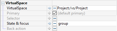
Later, you will connect your Panels to a VirtualSpace and connect components to vsFields in the Panel’s corresponding VirtualSpace. Select a Panel in the Panel’s tree-list and explore its properties in the Property Editor. Note the property Primary under Base > VirtualSpace > Primary; this is a boolean which must be true for only one of your Panels. Keep this property unchecked – secondary – for all other Panels.
Once you have placed components into a Panel, you are ready to connect the Panel and its components to a VirtualSpace. Connection to the VirtualSpace creates the variable-data binding that enables the component to perform actions in the application context, update instantly, present and edit data.
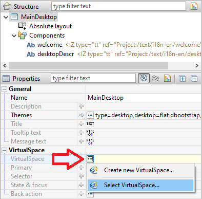
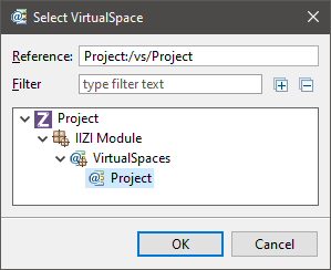
If your Panel is not connected to a VirtualSpace, select your Panel in the Panel Editor tree view and under the Panel Properties, click the … menu and choose Select VirtualSpace.
After this, you can click on State & focus and choose Select VS Component.
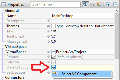
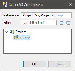
You can similarly connect any UI Component to a vsGroup, vsField or vsTable.